Thursday, January 29, 2009

The Happiest Place on Earth


Seven years ago, we had a family vacation to Disney World. Ignatius was 5, and his cousin, Amy, was getting married in Orlando. After the wedding, we spent some time on the grounds. It remains one of my all-time favorite trips we have taken.

When I returned, I "digiscrapped" the event in a Power Point for the web. When I saw Cathy Zielske's sketch that required nine different pictures of various shapes and sizes, I knew what I wanted to do. I picked certain representative shots from the Power Point, resized them, and... voila!... a layout for Week 9.

This layout focuses again on line as a design element. I like the layout a lot. In real life, the photos are really large and dominant. Once it's photographed, the pictures look smaller because they are on 12 x 12 inch paper.

Of course I had to find some fun Disney font for the page. I still have other stickers and such, so more Disney pages are in the future. Maybe they can wait for Max's turn.

I remembered how much I hate setting eyelets... grr. But I tried to get a visual triangle of them on the layout. The journaling card was a download from Cathy. It is slightly bigger than the photos around it, and I like its look on the page.

Saturday, January 24, 2009

Oh Baby

This card is for a friend who just had a baby boy. I used a generic white cardstock base. For my color panels, I used SU! Basic Gray and Perfect Plum. I stamped the sentiment from SU! Everything Baby in Adirondack Pitch Black. I also used this ink for the baby images, since I knew I wanted to color with my Copics. I used a Gelly Roll pen to accent the baby's onsie and the bubbles in the bath tub.

I think it's pretty cute. I used the "welcome, little one" sentiment from SU! Fun Phrases on the inside of the card.

Baby MacGyver

My son is fascinating to watch. I have always been big on "child-led" exploration. I was puzzled by parents who felt they had to take their grown-up bodies on the jungle gym at the park and felt they had to create play for their children. I much rather watch my kids and see how they go about solving their problems. I like to think of it as empowering them. Again, fascinating.

On this particular day, we were home. School was called off due to freezing temperatures. I turned on a Raffi CD that we had, and Max went a little bonkers. He didn't want to listen to it, but I figured he would get used to it. So, he decided to take matters into his own hands. He had to get to the stereo receiver.

He first piled the living room pillows and tried standing on them for a boost. He realized quickly that this idea was not going to work. Then, he brought in the laundry organizer and turned it upside-down. It was so tall, he couldn't climb it. Strike 2. Finally, he dumped the laundry out of the laundry basket. Once overturned, the basket was the perfect height and strength to get his foot to the middle shelf. Standing on the middle shelf, he could reach the receiver easily.

I admired his perseverance with this one. The photos are from my phone, as I couldn't bare to miss a moment of this by going to get my Nikon.

For this sketch, Cathy is stressing the concept of intersecting horizontal and vertical lines. She indicated that, when intersected, these lines give strength to the structure of the page. I remembered this idea from my layout editor days on my high school year book staff. It's pretty ingrained in me when I set up a layout. The intersection occurs at the black strip of words (horizontal) and between the 4 x 4 and 3 x 4 pics (vertical).

I wish I could recall the manufacturer of the sticker sheet I used. They are PERFECT sentiments for many pages about both of my sons. I do know that I used a 1 1/4" circle punch with some black Bazill Bling paper and popped up the two sticker pieces on dimensionals. I used Thickers Daiquiri brown vinyl letters for the "macgyver," and SU! That's Nice stamp set for the word "baby" (stamped in SU! Chocolate Chip). The background paper is SU! 12 x 12 textured Blue Bayou. I also inked the journaling panel with SU! Blue Bayou ink.

Tuesday, January 20, 2009

Groooooovy

Well, well, well. It's Tuesday, and I, JoLynn, have completed the color challenge on SCS. It's been a long time.

Today's combination was Bravo Burgundy, Regal Rose, and Kiwi Kiss. At first, finding a place for Regal Rose was challenging. You know me and pink. But, as true to my style, I just used it as an accent, and it wasn't too bad.

I dug through my patterned paper first to gain some inspiration. That's when I found the patterned paper, which I think is from the American Crafts Amplified collection. Since the pattern was so "mod," I decided to use what I call the "Partridge Family matting." Rectangular, with two opposite corners rounded. The ribbon and flower accents were a last minute decision. I think they look pretty stinking cute.

So, there you have it crafters. JoLynn's attempt at cardmaking on a school night. Now, on to grading...
Size: 5.5 x 4.25 inches
Paper: SU! Bravo Burgundy, SU! Regal Rose, white cardstock, American Crafts Amplified
Stamp: SU! Cheery Chat
Embellishments: SU! Old Olive Twill Ribbon, SU! Felt Fusion flowers, Spare Parts brads
Ink: SU! Bravo Burgundy

Monday, January 19, 2009

Sleep, Baby, Sleep...

...now that the night is over.
{for all you INXS fans out there}
Cathy's 8th Real World Color sketch involved using one of my absolute FAVORITE combos: deep chocolate and chalky blue. Ooohh, la la. The possibilities!
I decided to stay very close to her sketch, which is simply eight, 2.25 x 2.25 inch squares. I was cleaning up my e-mail when I found an e-mail from one of Max's day care teachers from last summer (yes, he did fall asleep in the cabinet underneath the sink). She sent me photos of him sleeping in all sorts of places during naptime. I added one we had of him falling asleep in the laundry basket, and one we had of him sleeping with Scott in our bed.
The argyle paper if Stampin' Up!'s Frosty Day DSP, which seems to be quickly becoming my paper of choice. Better order some more! Who knew? The stars were, I believe, one of the first embellishments I ever bought. I wish I could say the maker, but I really do not recall. The magnetic stamp set I used is called Rummage by Making Memories. I love that set, though I rarely pull it out.
My Basic Grey cutting mat was really helpful as I tried to line up my photos. I seem to be challenged in this area... at least when I look at some of the scans of my pages, I scratch my head at the difference between what I thought it looked like and what it seems to took like... I need a scrapbook level, I guess. I used my magnetic ruler, left over from my Making Memories paper cutter (God rest its soul), and the magnetic mat, and it seemed to work really well for alignment.
Now, I can no longer procrastinate. I have papers to grade. School starts back up tomorrow. I have been gone since last Wednesday with either snow days, holidays, or illness. I have LOVED crafting and scrapbooking as much as I have been able to. It helped me through my cold a LOT.
This is, alas, the last layout I will get to post to the Design Your Life site. They left the site available until 1/21... generous since the class ended the week of Christmas. I have downloaded what I need for weeks 9-12, it just won't be the same. It's even a tab on my homepage! I'll live, I suppose. Wish I could have kept up with this better.

Sunday, January 18, 2009

Valentine's Day for Husband

This is my Valentine for my Valentine. Short, but sweet. I used kraft cardstock, which is quickly becoming my favorite neutral. Kind of like the "Saws-All" of paper crafting, yes?

I also used some SEI patterned paper: Rochester from its Windsor collection. I used Heidi Swapp metallic self-adhesive chipboard hearts. The sentiment is from SU! Always, but I had a challenge stamping it. First it was crooked, then only part of it showed. Let's just say the panel of patterned paper was a lot smaller when I began. Finally, I opted for stamping the sentiment and then going over it with a fine tip pen. Looks almost like I wrote it, eh? I added some doodling to make it look like it was meant to look hand-drawn.

I inked the patterned paper and the card frame with SU! Basic Gray. For the inside of the card (also shown), I used SU! Happy Everything's "happy," and I then wrote "Valentine's Day" by hand.

I really like how simple this was... much bang for the buck. I also liked using some non-traditional colors for Valentine's Day.


Perspective

Quite a few years ago, I went to a Creative Memories party for the first time. I had known a little bit about scrapbooking, and I had done my own version of it for years. I bought several "essential' pieces at that party... my first album, my first oval cutter (a system!), a cutting board, some archival markers (fine tip and calligraphy), a bag. Yeah, I laid out some cash at that one. But Ignatius was growing, and I had tons of photos of him that needed a home.

Enter stamping. Shortly after the Creative Memories party, I attended my first Stampin' Up! party. It was all downhill from there. I went the stamping and cardmaking route for a while. A close friend became a demo, and I was sucked in for good.

I had plenty of excuses for not scrapbooking, including a lack of time. I still bought supplies knowing that, one day, I would need them. I subscribed to scrapbook magazines and the whole nine yards. I got the occasional gift mini-album done, which is no small task. I knew when I sat down and did it, it didn't really take too much time.

In the past year and a half, I have gotten in to the scrapbook groove. I think it feeds a part of me that wants to work with graphic art. It's funny, though, with all I have learned, and how styles have changed, when I look at my earlier layouts and compare them to some I have done recently.

So, without further adieu, the slide show below shows a birthday album that I have been making for Ignatius. It starts on the day of his birth (birthday #1), and continues through birthday #12. I am going to end this book at birthday #13 and start a new one for his teenage years. Who am I kidding? I also hate working with the Creative Memories scrapbook I have because the pages are not 12 x 12. Since I don't want to make the pages on the white background that comes with the album, and I am sick of having to cut my 12 x 12 paper, I am opting to start a new one at a time that makes sense. I also might opt for a different size album.

I started this one a few years ago. You'll notice some changes in my style over the past few years. Enjoy!


Saturday, January 17, 2009

He ain't heavy...

... he's my brother.

Cathy's second sketch for the second week of emphasis is one I know I will use again and again. We used an entire 8.5 x 11 page for a photo and title. And doesn't it just look gorgeous?

It was hard to choose a photo to make that big. I didn't want to have to Photoshop too much, though I really should venture more into the power of that program. So, I chose one from Max's first days in the hospital when his dad brought his big brother to meet him. From there, I tried to pick some photos in my stash that had Ignatius being a great big brother. It wasn't hard... he's a great kid. But I am biased.

I just love this layout. Can you tell? It was also a chance for me to put into words my feelings about Ignatius role as a brother in our family.

Fonts used: Berlin Sans FB and Dragonfly (free download)

Warm birthday wishes

This is a second birthday card I needed this weekend. It is also my submission for IC163 on Splitcoast Stampers. We were to find inspiration from PB Teen. I used the room to the left as my color inspiration. I loved the lighter gray with the navy and orange.
I had a lot of different arguments with myself about the design elements of this card. I knew I wanted to use the mitten DSP from the SU! Frosty Day line. I thought maybe I would add some snowflakes, but they just didn't look right. I finally decided on the SU! Sincere Salutations greeting and pulling in the DSP with some clear button embellishments. I added the Spare Parts brads for a metallic feel, much like the inspiration room. I also included a photo of the inside. That message is from the Full of Life set from SU!.
The technique with the buttons is fairly simple. At first, I thought that I could punch out the circles, but I didn't have a punch that fit the diameter of my button sizes exactly... and that bugged me, of course. I decided to cut after adhering, which ended up being a very good idea. I took a small brush and applied a light coating of Mod Podge to the back of each button. Then, I placed the buttons on the DSP. I used my paper piercing tool to pierce the button holes, and opted not to thread them, as that would make the card a little bulky when mailing. I sanded the sides and back a bit, also. I used some Tacky Glue to adhere them to the card.
My other paper choices included SU! Going Gray and some textured navy that might be Bazill, but I am not sure. The ink i chose was SU! Night of Navy. In all, I am fairly pleased with this card.


Friday, January 16, 2009

Happy Day!

This layout cracked me up, as I am always saying, "Oh happy day!" to my students. So, when I saw it was an option to use Cathy's pre-made template, I jumped on it.

This is her first sketch from week 8, a second week on emphasis. Week 8 uses photo sizes as the key to emphasis. The bottom photo for this 8.5 x 11 layout is 7 x 5 inches. The other photos, of lesser emphasis, are 2 x 2 inches.

I bought this paper with these pictures of Max in mind. I saw it and thought of candy canes. That might be why We R Memory Keepers called it Christmas - Candy in their Write Out collection. It was a nice, heavy paper. On the back, there were four other squares of different patterns. It was a shame not to use them, but I'll live.

The base cardstock is SU! Baja Breeze. It's a Baja Breeze day for me today, I guess. It was the best match for the blue stripe in the paper. I decided to use my Fiskars scallop blade for the top of the main photo mat. I also decided to mat the photo with The Paper Element's Fruits: Strawberry paper to make it stand out just a bit. I had some of this left over from my last card, and the red matched perfectly. I wrote in SU! Rose Red.

A Real Color Challenge for Me


I needed a birthday card for a friend. In looking at Ann's blog, I was reminded of Kristina Werner's color challenge. I was completely out of that loop!
When I looked at the challenge, I thought, "What a week to decide to hop back in the loop!" Ruby Red, Pumpkin Pie, and Whisper White?! Could that be any further from any color choices I would make?! At that point I knew... the challenge was on.


For my own sanity, I had to downplay the Pumpkin Pie (orange, from here on). It had to accent the red. So from there, I went to my patterned papers to see if anyone already combined these colors for me (slacker!). No such luck.


I did find a piece of Fruits: Strawberry paper from The Paper Element that I very much liked. I used both the patterned and the solid side of that paper. Looking through all of my oranges, I found one in the latest SU! mini catalog that worked well from the Frosty Day Designer Series Paper. I accented with it as a mat for the main panel and the sentiment panel.


I had yet to use my scallop blade for my Fiskars desktop rotary cutter. I was very pleased with how easy it was to change the blades. And it cut like "buttah." The Build-A-Brads were an opportunity to showcase all papers used. I was going to leave it at that, but I felt ribbon was needed. I was surprised to find that I had some sheer orange ribbon. That was just what I wanted, because I didn't want the orange to dominate. Rather than a bow, I went with a linear design with the ribbon. I colored the SU! On Your Birthday stamp with Ruby Red and Only Orange markers.


I think it looks cute, and I know the person for whom I made it will love it.

Emphasis


In weeks 7 and 8 of the Design Your Life class, the emphasis is on... emphasis... as a design element. For the Real World Design part of the class, Cathy asked us to find emphasis in the world around us... something that is exceptionally large next to something smaller so that one's eye is drawn to the larger item. I didn't make it far before I realized I have real world emphasis in my living room! Check it out. The large mirror above the fireplace is one of the first things people see when they enter my house. And, I must say, it does catch the eye quite nicely. Ignore the pillows... my three year old's attempt at interior design. :) The large windows make quite a statement, too. So large we have yet to figure out what window treatments would not take away from the effect of this design.


{Gasp!} A Card?

For a while there, I was just a card gal, with very little getting done in the area of scrapbooking. Then, I went to CKC, took Cathy Zielske's Design Your Life class, and was transformed into a scrapbooker {again}. Today, necessity has me cardmaking. It's amazing how the principles are similar in both paper crafts.

While cardmaking and scrapbooking, I always find daily challenges and sketches to be helpful. Today is no exception. I used Laura's Sketch 17 (shown) from 2 Sketches 4 You. I decided on my colors using the Kuler site at Adobe. This combo is called omex by dh.

I needed the card for a friend who suddenly lost her brother to these freezing cold temperatures. It's really hard to find words when losses are sudden and young (at least 37 is young to me... and I am sure to his family).

I am trying not to cheat the insides of my cards, as I do sometimes when I am rushed, so I am also showing a photo of the unity (hello, Cathy!) between the inside and the outside of the card.
Size: Completed 5.5 x 4.5; card base without sentiment panel: 4.5 x 5
Stamps: Hero Arts Thoughts Today, SU! Hope for Comfort
Paper: Brown cardstock (Hobby Lobby), Basic Grey Periphery Vineyard; SU! Baja Breeze, SU! Very Vanilla, SU! Not Quite Navy
Ink: SU! Baja Breeze
Ribbon: Offray Mudpie
Nestabilities: Labels One

Thursday, January 15, 2009

What a difference eight years makes


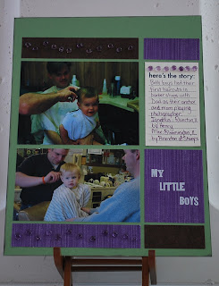
I can't get over how much technology has improved in such a short period of time. This layout is of my two boys getting their first haircuts. Ignatius' was in 1998. Max's was in 2006. The photo of Ignatius was taken with a film camera. I got prints, but also got a floppy disk with all the photos on it. I thought I was toooooo cool. And it was in 1998, by golly.

The picture of Max was taken with my Nikon Cool Pix. It is crazy unbelievable how much more pixelated Ignatius' photo is. The file size of his was quite small (22.4 KB), as opposed to the photo of Max (138 KB). Still, Max's photo from two years ago is a lot smaller than what I take with my Nikon D60. I take some whopping huge photos with that, especially if I think I will want larger prints. It's just amazing how much things change.
This layout was for Cathy's Real World Color sketch for week 7. Love the sketch! She referred us to the website kuler.adobe.com, which gives thousands of potential color combinations. She said we could use the one she chose, or we could pick one of our own. I liked what she chose, but I did end up browsing for my own. I picked one called Wedding Colors 3 created by sararachelpaul. Now, those who know me might find it life's little irony that the username for this person includes the names of my two nieces, who are sisters (Sara[h] and Rachel Paul). Crazy.

Anyway, I really wanted to use the purple as my base. Lo, and behold! I had no 8.5 x 11 pieces of that deep purple. Darn. So I chose the green. My paper choices were: Double-Sided Mulberry Chocolate/tan by The Paper Company (brown), Pages in a Snap Purple Stripe (purple), vanilla cardstock, and SU! Wild Wasabi. I wrote and inked in SU! Eggplant Envy. The Baubles are from Stampingbella, and the letters are rub-ons from daisyd's.
Ignatius and Max are so very dissimilar. However, when I look at these photos side by side, I actually do see similarities, especially in the shapes of their faces and that little dimpled chin they get from their dad. The barber shops also seemed to follow a similar color scheme, too. :)

Wednesday, January 14, 2009

Oooh, baby...

...it's COLD outside. When schools close in Central IL, you know it's immediate human popsicle when you walk outdoors. Darn. I will just have to work on some scrapbooking. :)

Tuesday, January 13, 2009

Baptism Layout

It only took three-and-a-half years to make this layout! Actually, it took a couple hours with the right sketch, thanks to Cathy Z.

This is an 8.5 x 11 double-page spread. The design element we are using is emphasis. What is the eye drawn to in this layout? The 4 x 6 photo of Max and the word "baptism." This multi-photo layout is supposed to be fairly simple, with very little journaling needed.

In Cathy's sample, she had colored cardstock behind the smaller photos. With my photos having so many backgrounds and colors, I just could not pick a color that would leave Max as the emphasis and allow others in the photos to be seen without fighting with the paper. So, I decided to resort to some matting, which Cathy Z. does not do a whole lot. The matting under Max is Chocolate Chip, the same color as the background. That's where I started the matting because the light blue paper (My Mind's Eye Bohemia Backyard "Memories" Datmask/Teal) was blanching him out. He is already a very fair-skinned child wearing a cream baptismal outfit. I needed more oomph.

I matted the smaller photos with the teal that is on the main panel (had just enough... whew!). To give it some unity, I decided to use my Scor-Pal and score some lines, pulling the smaller pictures even closer together. I used Thickers brown felt alphabet stickers and my own handwriting on the rest.

Last week, our Church celebrated the Baptism of the Lord. Father Jerry's homily mentioned what we, as parents, say in the rite of Baptism. One thing that struck me was when he mentioned that we ask for Baptism for our child. In asking for that, we are undertaking the responsibility of raising him in the Catholic faith. If we think too hard about that, the responsibility is a bit overwhelming, particularly since Max is attending public school due to his IEP. It seemed somewhat easier with Ignatius attending Catholic school. We knew what he was getting day in and day out as far as his religious upbringing was concerned. Max will take more effort from us... which might be yet another one of God's lessons while raising our boys. It will not be easy.

Anna turned to Mary when Mary presented Jesus at the temple, and Anna told her she would endure tremendous pain as Jesus' Mother. I think that is a lesson for us, too. Even Mary wasn't guaranteed an easy go of it, and she was the Mother of God. In comparison to what she had to watch her Son endure, I think I have it quite a bit better. Tonight's life lesson. :)

Sunday, January 11, 2009

Suddenly...


...last summer...

Ah, what a great song by The Motels. When I was printing these pictures, I was trying to think of a great title for the page, and I kept thinking, "...one summer never ends, one summer never begins..." And thus, a page was born.
For some reason this scanned a little lopsided, so bear with me. Either that or it IS a little lopsided, but in doesn't look as much so IRL. I bought this paper (Sassafras Lass Whale of a Tale) on sale long ago with every intention of doing a swimming page with it. In Microsoft Publisher 2007, there is an option when you change your font color to pick your font, so I chose the blue of the water behind Ignatius' goggles for the font. I chose SU! Brilliant Blue cardstock for accenting as well as for the doodled frames around my photos.
The pictures are from different summers. Ignatius is in a pool in our backyard in 2006. It was never resurrected due to the murderous act it did on our lawn. The photo of Max is from summer 2008. He was going down the airplane slide at Anderson. He loves the slides and the water, that's for sure. Made me remember that the weather in January does not stay around for good.
The theme for this sketch was emphasis. The larger photo was to work as the focal point for the page, with the title bringing the reader's eye to that photo as well.

Saturday, January 10, 2009

Real World Color #4 - Warm Color Semi-Wheel

So far so good. Got one page done tonight. Lots of stops and starts.

This page was inspired by Cathy Zielske's fourth Real World Color sketch. Her idea with the colors is that they come from the same half of the color wheel. She was looking toward earthy tones she had noticed on a restaurant in St. Paul, MN.
My idea began with a sticker I bought on a sheet from The Paper Element. It was a great big cardstock sticker that was waiting for just the right page. I thought I had plenty of pictures and thoughts to go along with this theme.
I chose from my patterned papers after that. I used a variety of companies to get the feel of the colors Cathy had chosen. Since I love these color choices, and since I own a scrapbook-store's worth of paper in these hues, my choices were almost endless. I chose: Creative Imaginations Sonnets Paisley, Cosmo Cricket Jack Sprat (red), The Paper Studio A-Z Textured Brown, and vanilla cardstock. Embellishment-wise, I used only a few; the sticker mentioned before, some dimensionals to give the title depth, and brads from Spare Parts. My SU! Curly Label punch was used next to the journaling, mainly to add the paisley pattern in a small way in another area. I distressed the red layer of the title, because perfection would have been all wrong on this page.
I made my photos black and white because they had a LOT of colors going on that would have interfered with the other colors contained in the layout. I think there's more impact this way.
I think this nicely demonstrates my life as I know it. It may look like an oxymoron, but I have learned to embrace the chaos. It's what i call my "new normal." :)

Monday, January 5, 2009

Online Garage Sale!!

Karen and I have some of our wares online and ready to roll. If you are interested in some low-price, high-quality craft goods, you will want to check this out. Just click the link on the right side of the page. We're keeping the items in the first 5 folders up until they are gone. I posted a TON of patterned paper, and Karen has some great ink/cardstock packages online. The best part is, you don't have to wake up early Saturday to get the deals!

Saturday, January 3, 2009

Give Triadic a Try

Yes, I am feeling like a scrapbooking queen lately. I am also avoiding some other things I need to do. This feels better at the moment.

What a better page to do on a dreary, gray, cold, January day than a July 4th layout! Woo hoo! This marked the beginning of my "wannabe photog" phase. I was starting to look at photos through the eyes of a scrapbooker.
In our Week 6 assignments, Cathy gave us a set of triadic colors for the Real World Color layout. Since I had already completed a "Halloween" layout for 2008, I challenged myself to think outside of Halloween for these colors. Triadic colors are colors that sit on opposing sides on the color wheel. The picture shown is Cathy's depiction of where the three colors would be on the wheel. You can use all three colors, add a neutral, or drop a color and still be pretty safe in your design.
At first, I tried finding pictures with one or more of these colors. Max's shirt had a little green, and I had yet to scrapbook this photo (one of my favs), so I went with it. I used black as my neutral. Then, surprisingly, I used some patterned paper that I did not necessarily like presented as a 12 x 12 sheet. This was from a huge holidays scrap pack from The Paper Studio (Hobby Lobby). As I thumbed through my papers, I realized that this pattern included all of the colors (plus a few more), and the stars went well with the topic. When cut into smaller "gulps," the pattern is not too bad.
I decided to cut out some of the stars from the scraps to add unity to the design, rather than just leave the big empty color blocks (which would have looked OK, too). To finish it off, I used some chipboard Thickers (black) and my SU! Curly Label punch for my scant bit of "journaling."
Ah, makes me want to grab my suit and head to the pool. AHHHH! Wait! Gotta get my body pool-ready first before I scare small children. :)

Friday, January 2, 2009

Ice Work!

Cathy Zielske's sixth week of class focused on the concept of unity in design. For this layout, we used a double-page 8.5 x 11 inch spread. Her point with this sketch is that the continuation of a layout across two pages opens up a perfect opportunity to unify the work.

Here, I used SU! patterned paper with dots that matched different colors in the pictures (look soon for the color focus!). The paper "jumps the gutter, unifying the two pages as one layout. I also slightly jumped the gutter with the title (Thickers Tinsel foil letters... yummy!), placing the exclamation point on the other page.

I decided to go more with gray and navy. Why? Gray day, navy coat... and I like the two colors when they combine.

I got to use some of my SU! felt snowflakes, also. I used one under the dot of the "i" in "ice." Further unity was included by placing a few more of these snowflakes in the lower right of the layout.

Thursday, January 1, 2009

All About Me

In October of 2007, Karen and I went to CKC Kansas City. While there, I bought Lisa Bearnson's album, "All About Me." I was interested in the idea of archiving some thoughts for my children and others who might get a kick out of it.


I began making the album this summer. The album comes with all the instructions and pieces you need. It was my first Lisa Bearnson scrapbook, and I must admit, if you don't have a whole lot of scrapbooking materials, her kits are fabulous. Everything was cut to size, hole-punched, adhesive-backed... you name it. And yet, she still allowed for whatever creativity you desired. Below is a photo of one of the kits "before production."


The first thing I did was put all the pages together as much as I could. That was fairly brainless. The only thing that I did not like were the rub-ons that came with the kit. NOT good. However, this kit came out in the infancy of rub-ons, so I'll cut Lisa some slack.


Then, I did several pages, but I did not want to rush. Alas, there it was, the end of December 2008, and I was not finished. I had two more spreads. I finished them on New Year's Eve and, voila! I was done with 2008 in 2008! The photos below are what the actual book looks like. I almost scanned the pages, but I wasn't sure of the mood of my scanner today. :)