Monday, June 30, 2008

You're the Berry Best

Today's card idea had its genesis thanks to today's technique challenge. We were asked to use pastels... gotta say I was excited. I love pastels.

This card, however, too a life of its own. The technique looked simple enough. But then, mistakes kept happening. It started as all one "flattened" and masked image, but had to be cut into layers to salvage the card. I do like the way it turned out. It's far from my style, but I think that's what makes the challenge, too!
I started with a base of Papertrey white. I pounced using Glorious Green pastels. Then, I had to re-do, as I got a little messy and had some nearby pastels added in there. Then I stamped the strawberries one at a time and pounced them with Real Red pastels. Well, the Real Red decided to take over, so I cut the strawberries out (they had been masked at first) and re-pieced them on a new pounced background. I then decided to do the sentiment. Those of you that know this sentiment stamp know I had to use the ol' Stamp-a-majig. Well, I didn't have the stamp as dry as I thought, so I ended up with shadows of other words from the stamp. Hence my choice for a sentiment panel. It's raised on Dimensionals. The ribbon and dew drops were added for some dimension, as was the raised "Berry." The background paper is Stampin' Up!, but I can't recall what. I think it might be from a scrapbook packet.
Size: 4 1/4 x 5 1/2 inches
Stamps: SU! Fruit Medley and Fruity Phrases

Sunday, June 29, 2008

Ah!

I love vacation... don't get me wrong. But it felt sooooo good to make a card tonight. :) The laundry is on its last cycle, the luggage is unpacked, and tomorrow is just another {manic} Monday.

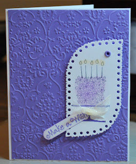
So, here is today's submission for a CASE of the Featured Stamper for this week, Michelle, aka Chelemom on Splitcoast. I changed a few things to her card, Ellen Hutson Stamp, but not much.

This is a birthday card for a friend for next week. It has so many elements that make me think of her, particularly the Cuttlebug background. While on vaca, I was in Michaels in Reading, PA, when I spotted these lovely Martha Stewart tags. They have all sorts of shapes and all sorts of edges. They stamped well, too.
Size: 4 1/4 x 5 1/2 inches
Paper: SU! Lovely Lilac, Papertrey white, Martha Stewart tag
Ink: SU! Basic Gray, Stampin' Pastels: Lovely Lilac and Barely Banana, SU! Lovely Lilac marker
Stamps: SU! Blooming with Happiness, Studio G Series 6
Embellishments: SU! Lovely Lilac eyelet, sheer white ribbon attached with glue dot, SU! window punch used for sentiment

Monday, June 23, 2008

Are you KIDDING Me?!

Here I sit on vaca in Pennsylvania when I get a call from an unfamiliar number. Of course I am ordering room service, and of course, no one else in the room can answer my phone.

It's Brenda Peterson from PAPER CRAFTS magazine. Yup... that's what I typed. I sent three cards to them for their Stamping Royalty contest. Lo and behold! They think I am stamping royalty!! They chose a card from the two-step stamping category. I used Papertrey's Out on a Limb set.

So, I am now busy getting the card off of my site (and SCS). Info about what I "get" can be found on this link. (Thanks, Karen, for letting me know my previous link was old.)

I am so excited! I called Karen immediately, of course, as she was the catalyst for me to submit anything anywhere. Yeah, yeah, yeah! My card will be published in the November/December issue of Paper Crafts. Woo hoo!

Saturday, June 21, 2008

Frank Lloyd Wright

My three-year-old son does a lot of what is termed "echolalia." It's the repetition of phrases and sentences in seemingly meaningless situations. He is speech delayed and on the autism spectrum, so echolalia is not that unusual. We are just thrilled that he is speaking.

What does this have to do with Frank Lloyd Wright, you ask? Well, Max has a repeated saying lately: "Do you like ice cream? No, I LOVE ice cream!" Those sentences, slightly morphed, kept repeating in my head with this inspiration challenge: "Do you like Frank Lloyd Wright? No, I LOVE Frank Lloyd Wright!"

I mean, look at his designs... clean lines, lots of open space... gorgeous. I love almost everything I have seen of his, and I tend to look at things... houses, windows, patterned paper, stamps... and judging them in terms of FLW.

So, when I saw today's inspiration on SCS was Frank Lloyd Wright, I was VERY excited. I thought about this all day. I consulted with my husband, who thought I was certifiable. I had to be serious as a heart attack with this one. If there is an artist more in tune with how my overly-linear mind works, I would like to meet him or her.

I found this image when browsing for window images. It can be found at the {nearby} Dana-Thomas House in Springfield, IL. I am sad to say that, for the seven years I lived in the Springfield area, I did not fit in a visit. Now, that makes me sad. We might need a July field trip!

I started my journey with this piece with an idea in my head. I would try to use the paint-emboss-sand technique I used in this project. Alas, I did score out everything pretty well, but I totally boogered up the sanding. So, with the bit of painted cardstock I had left, I decided to draw the image. I tried to be as meticulous as my human hand could be, knowing there is no margin of error with his images. I decided to do some shading with my Chocolate Chip marker, and I used my white watercolor pencil for some shading as well.

I searched for a quote by FLW (apparently, he was pretty vocal), and I found this one. I think it is PERFECT for the card and the main thing that draws me to his work... his use of space.


Size: 4 1/4 x 5 1/2 inches
Paper: SU! Creamy Caramel (base) and Basic Black (painted with Making Memories Espresso acrylic paint)
Ink: SU! Chocolate Chip and Basic Black markers, white watercolor pencil
Stamps: none

Friday, June 20, 2008

RAK


What a pleasant surprise! Stampin' Annie (aka Ann Cox), fellow stampaholics anonymous charter member, sent me the cutest random act of kindness. Here's a pic. Thanks, Ann! It came at a great time and brought a smile to my face.

Thursday, June 19, 2008

Ric Rac Paddy Whack...

I dislike ric rac, so imagine my sursrise when I actually found an old SEI sticker sheet (Backstitch Blue Elements) with a smidge of ric rac on it to use for today's Ways to Use It challenge. The stuff just perplexes me as to its purpose (I guess just decorative?).

Little did I know it has origins in the crochet world. See when I am puzzled, I research. It makes me think, "There's got to be more to this than I am seeing." So, if you are interested, here's a quick read.

I still do not prefer ric rac, but maybe looking through the gallery for this challenge will change my mind.
Size: 4 1/4 x 5 1/2 inches
Paper: SU! Creamy Caramel, Barely Banana, and Chocolate Chip
Brads: Spare Parts
Letters: Heidi Grade self-adhesive chipboard letters - Wild Daisy Rd.
Embossing: Scor-Pal
Ric Rac: SEI Backstitch Blue Elements sticker

Wednesday, June 18, 2008

Foil Inspiration

I kept fighting with myself over which of the three samples given for IC 132 would be the one that inspired me most. I loved this one, and envisioned multiple layers of clear embossing powder and a cracked finish. However, I was not inspired to drag the embossing stuff out tonight. (I started this a bit late) The one I chose kept catching my eye. With more time, perhaps I would pull out some Pearl Ex. But again... it was late.

I thought immediately of dry embossed metallic paper. Haven't looked at the gallery yet, but I would bet several others thought of this, too. Either that or inking the Cuttlebug folders to get the color effect.

I went for a softer feel with my card. I popped up a few of my square pieces to coincide with the inspiration piece. I just love silver and blue together. I placed vellum behind the silver pieces to soften the interaction between the silver metallic pieces and the Soft Sky base.
The ribbon was my final decision. I simply wrapped it rather than worrying about a knot or bow. I didn't want it to take over the card.
Size: 4 1/4 x 5 1/2 inches
Paper: SU! Soft Sky, silver metallic, and white vellum
Stamp: SU! Amazing to Zany
Embossing: Cuttlebug folders
Metal frame: SU! Hodgepodge Hardware

Birthday Double Challenge

Today, I decided to combine SCS Sketch Challenge 181 (shown) and Color Challenge 171 (Soft Sky, Basic Black, and Kraft). I created this birthday card for my OLDER brother whom I believe is turning 50 next week (hey, I have 7 siblings, don't judge me on the "I believe" part). The color challenge reminded me that, despite wanting to purchase Kraft cardstock, I keep forgetting when I order (hey Karen, are you reading this?). So, I sorted through my punchouts to find SU! Boxes & Tags Pockets & Pieces, Assortment 1. That had plenty o' Kraft embellishments. The one I used around the "Birthday wishes" sentiment was actually more of a "plate," but I screwed up one of the holes trying to put ribbon through it. No problem, I just cut off the sides and used my corner rounder. I kind of like the effect. The sketch was straightforward enough that I could really toy with how I handled the balance in the card. I made my "balance triangle" with the main sentiment, the tag with a mini-sentiment, and the three Build-a-Brads. I like the way it turned out. Manly, yet with a ribbon. :)

Size: 51/2 x 6 3/4 inches
Stamps: SU! Sincere Salutations and Lots of Thoughts
Paper: SU! Basic Black, Ultrasmooth White, Soft Sky, and Kraft, The Paper Studio Cute Blue Ovals
Ribbon: Offray wide black grosgrain
Brads: Spare Parts and SU! Build-a-Brads
Ink: SU! Basic Black

Tuesday, June 17, 2008

Changito Celebration

It's a swingin' good time on this card. I decided to try the {Caard}varks microchallenge: birthday card for a man by midnight tonight. This was helpful, as I need two "man cards" in the next two weeks.

I think this one will go to my brother-in-law. It's so fun, yet not overly childish, in my humble opinion.
I had pierced semi-circles and was going to leave them pierced, but it just seemed so plain. So, I decided to thread some twine through the holes... yes. It looks great with the card, but was one of the most illogical things I have done. The holes were just about the same diameter as the twine. Yeesh. I also tried to French knot at alternate ends. [emphasis on "tried"]
Overall, however, I really like this card. I like "guy" colors... always have. I suppose I am a fall kind of gal. He will just be shocked that I actually sent a card this year. :)
Size: 4 1/4 x 5 1/4 inches
Stamps: Changito Swing (Stampendous!), Studio G
Paper: SU! Old Olive, Chocolate Chip, Very Vanilla, and textured Close to Cocoa
Ink: SU! Old Olive, Close to Cocoa, and Creamy Caramel
Embellished with twine and Dimensionals

Monday, June 16, 2008

Birthday CASE-ing

This week's Featured Stamper, DeniDill (aka Denise), has a gallery that has served me well for birthday cards. I CASEd one of her very first SCS posts, stamp grateful, for a birthday card for Karen's daughter Maddie. I did not photograph the card, as Maddie's photo was on it. However, picture this: Pretty in Pink, Basic Black, patterned paper with a white distressed background and black harlequins, Maddie's adorable face on each stamp, and a bow at the bottom with sheer white and wide black grosgrain ribbon. Yeah, it WAS cute. I agree.

Today's card is for my nephew-in-law. I am sure he will get this late, as his birthday is Wednesday and the snail mail from IL to PA is... well... SNAIL mail. But, I am bound and determined to fulfill my 2008 goal of getting cards to significant family and friends, late or not. I CASEd Denise's Spotlight on Giraffe card for this one. I kept many things the same: color scheme, spotlighting technique, ribbon technique. I had done paper piercing, but hated the way mine looked, so I placed the sentiment on top of it. I kind of like the tab.
So, I put Denise's gallery to some good use over the last two days. Now I want to backtrack to the Inspiration Challenge, because I have some cool ideas in my head for that.
Size: 4 1/4 x 5 1/2 inches
Paper: SU! Blue Bayou cardstock and Prints DSP, SU! Very Vanilla and Sahara Sand, Bazzill textured brown
Ink: SU! Basic Black, Brocade Blue, and Summer Sun
Punches: Corner rounder, 1 inch circle punch, 1 1/4 inch circle punch
Hardware: SU! Hodgepodge Hardware
Stamps: Studio G clear acrylic
Ribbon: SU! Brocade Blue stitched grosgrain

Thursday, June 12, 2008

Kazan Sketch 2

Branching out beyond Splitcoast challenges, I happened upon a card by SmilynStef that caught my eye. In reading her description, she mentioned this site, 2 sketches 4 you, which presented sketches to people. So, I thought I would give Kazan's second sketch a try (posted). The first thing I thought of was the Bazzill scallop template that I had for stitching. I figured it would give me a nice, consitent scallop. It did take a while to stitch, but I like the results. Cutting the paper around the scallop, however, was a bit more challenging. Doesn't look too bad in the pic, though.
Since my corners did not meet (darn it), I decided to place some medallions there. These are the larger version on what I stamped within the scallops (SU! Big and Little Pieces). I have a recent affinity for textured paper, so I went with this base paper from The Paper Company. Because it's not cardstock, and because I didn't really want the back of my stitching out for all to see, I mounted the piece on a piece of SU! Bravo Burgundy (also the ink used for stamping).
The flowers were white ones from the SU! Pretties set that I colored with marker/dye ink. The Sahara Sand flower came out way more green than I anticipated.
I have no "Happy Anniversary" stamps, alas. So, I thought I would go with the initials and some of my own script. I think it is HYSTERICAL that the initials spell "ha" as well. I hope that my recipients can tell I am not laughing at their wedded bliss. For the brackets and initials, I used felt Thickers.
Now, to mail this in time for their anniversary. I seem to have issues with that lately.

Tuesday, June 10, 2008

Happy Birthday to Scott!

My husband's forty-third birthday is tomorrow. With all the other June cards I had been making, I can't believe I waited until now for this one.

I {reluctantly} used today's color challenge. Red and I do not get along, and the colors were So Saffron, Real Red, and Regal Rose (I substituted Rose Red, as I did not have Regal Rose ink). Two reds! Yikes!

In all, it doesn't look as bad as the struggle was. :) I used my Changito Notes set from Archiver's (and Stampendous!) because the two little monekys were perfect for a card from our "two little monkeys" and their mama.
The photo does not necessarily show all of the real-life embossing. I used my SU! Shapes Classy Brass to emboss lots of circles, and a few of the circles on the right.
Size: 4 1/8 x 5 1/4 inches
Paper: SU! So Saffron and Real Red, Papertrey white
Stamp: Stampendous! (for Archiver's) Changito Notes, SU! Fun with Shapes
Colors (inks and markers): SU! Basic Black, Real Red, Rose Red, Creamy Caramel, Close to Cocoa, and Garden Green
Ribbon: Michaels Special Value

Monday, June 9, 2008

PMSabella

Now, what Bella stamp has my name written all over it? You got it... PMSabella. I knew I had to have it, but, frankly, I have been using Cosmobella more than this one. It was time.

I decided to try (with some trepidation) a "surprise pop-up" technique. The link is to its tutorial. This is for TLC172.

"Somewhere in the middle, it gets awful queer to me." -Big Bird, ABC-DEF-GHI {if this reference is lost on you, see the embedded video at the end of this post}

I was OK when I had to cut, but the scoring measurements (somewhere in the middle) just did not work out. So, I eyeballed a lot of that. It could have been me, since craft measurements seem to give me a hard time. But, most times, I was never ending up where the tutorial said I should be.

I think it turned out pretty cute. I'm not complaining. One photo is of the closed card. The other shows it open with its sentiment:"Life is uncertain... Eat dessert first." You might remember that sentiment from a previous card.


Size: 4 1/4 x 5 1/2 inches
Paper: Yuletide by Tinkering Ink, SU! Baroque Burgundy and Ultrasmooth Vanilla
Ink: SU! Basic Black, (markers:) Barely Banana, Going Gray, Brocade Blue, Baroque Burgundy, Always Artichoke, Rose Romance, Creamy Caramel, Brilliant Blue, Close to Cocoa, Chocolate Chip, Green Galore, Bliss Blue, and SU! Watercolor Pencil (Barely Banana)
Stamps: PMSabella (Stamping Bella), Dessert First (Stampendous!)

Hemp ribbon: SEI


Early Big Bird (1969)


Sunday, June 8, 2008

Flowery CASE

This is a card I made for my anniversary, coming up on Friday the 13th. My husband and I will be celebrating our sixteenth year of marriage. It's a bit surreal... so much has happened, yet so little. I believe we are both healthy and happy, and anything that seems like a struggle dims in comparison to what some other couples face.

I CASEd this week's SCS Featured Stamper, Cindy (a.k.a. YLM). Her card, Embossed Petals, used the SU! Pick a Petal set with heat embossing. I decided to break out a Cuttlebug set I bought a while ago that included the die and embossing folders for a similar flower. I took off a bit from her design, but it definitely got me started. I had to keep it a bit on the masculine side, but there are still some girly aspects.
Size: 4 1/4 x 5 1/2 inches
Paper: SU! Ultrasmooth Vanilla and Au Chocolat, Bazzill brown textured
Ink: SU! Chocolate Chip (edges of petals and sentiment)
Ribbon: SU! Creamy Caramel taffeta and Chocolate Chip twill
Corduroy Button: Who's Got the Button (Bazzill)
Embossing: Cuttlebug

Saturday, June 7, 2008

Caardvarks

I have been popping in and out of the Caardvarks site for a couple months now. Today, I decided to take the plunge. The theme for this month is, "Drink Up!" Like I need another opportunity to use my Cosmobella? How could I pass that up?
So, here's my first (and I daresay NOT my last) Caardvarks entry: Live it Up!

The details:
o I have decided that Saturday and Sunday will be scrap days. That means I will try my best to use only scraps from previous projects on new ones. Therefore, I am taking a stab a some of the colors on this card.
o I decided to use SU! Soft Sky as a base. On top of that came Bazzill gray textured cardstock, SU! Ultrasmooth White and Creamy Caramel, and The Paper Studio Brown and Blue Dots patterned paper. I used the patterned paper to piece her outfit, and colored the rest of her with marker or pencil.
o The scallops are actually a series of small circles (1/4", I believe). I saw this in a scrapbook magazine and thought it was an ingenious scallop method.
o I had not used the sentiment stamp yet. It's designed by Alison Wong for Studio G. I love the little $1 Studio G clear acrylic sets at Michaels. I have to say, I needed to convince this one to hold on to ink, but eventually, I was successful. I popped up the "it" with pop dots.
o Cosmobella... how I love her. She is one of my favorite stamps. I really want to purchase some other Bellas, but I have not used PMSbella yet, and she needs some ink before I move on.
o I embellished with SU! Creamy Caramel taffeta ribbon and hardware from SU! Styled Silver Hodgepodge Hardware.
I think she's cute. But then again, any card with her I love. Slight bias.

Master Bedroom Inspiration


For today's IC 131, we had a room to use for inspiration. I came up with two cards that could not be more dissimilar. The first one, the pink one, I am not crazy about at all. However, with as many redos as it got, I figured taking a photo would be the least I could do. I tried a close up on the metal tag, as in the larger picture it looks white. It is actually a brushed silver that I stamped with Staz On and inked with Adirondack acrylic.

I am up this "early" because I created card #2, a card I like MUCH better. I think it better captures the softness and patterns of the room.

I'd love to hear which one you prefer.


SERENITY
Size: 4 x 4 1/4 inches
Paper: SU! Pink Passion and Ultrasmooth White
Stamps: Serenity Now (My Favorite Things)
Embellishments: Vellum flower, sheer white ribbon, olive grosgrain ribbon, Thickers, Dots Fiskars embossing plate
Ink: Black Staz On, Adirondack white acrylic

GOD IS
Size: 4 1/4 x 5 1/2 inches
Paper: SU! Bordering Blue, Deja Views Wedding, and unknown (inside panels)
Stamps: SU! Refuge and Strength
Ribbon: Off white from Michaels
Hardware: SU! Styled Silver Hodgepodge Hardware
Ink: SU! Bordering Blue and Adirondack white acrylic

Friday, June 6, 2008

Happy National Yo-Yo Day

Interesting, yes? It's National Yo-Yo Day! Who knew? Apparently me and the hundreds of people who do the SCS Limited Supply Challenge.


We were asked to choose among National Yo-Yo Day, National Doughnut Day, or National Gardening Day. I was intrigued by the yo-yo, of course.

So, I search for some funky yo-yo design to CASE. Suddenly, I happen upon a yo-yo of "a different color." I suppose the quilting world has known of yo-yos like this for quite some time. The round felt embellishment on my card is called a yo-yo circle. There are tons of sites that show the yo-yo circle, and it is apparently a useful embellishment for many, many crafts. It was called a "whirligig" for some time before 1928, when yo-yo quilts went in to mass production. There is a lot of interesting quilt history on the site where this picture is house.

So, knowing this interesting little embelly is named after our friend, the yo-yo, I decided to use it for today's card. It doesn't necessarily celebrate National Yo-Yo Day, but it keeps the yo-yo in mind... an inspired piece, if you will.

I will say, for someone who does not consider herself a seamstress, this was not difficult to make. I looked around at some sites. There are some sites where people use shapes other than a circle (like a heart). I thought I was doing well to make one circular one. :)

Size: 4 1/4 x 5 1/2 inches
Paper: SU! Brilliant Blue and Barely Banana, SEI Dill Blossom
Stamp: Friendship Sentiments by My Sentiments Exactly!
Ink: SU! Brilliant Blue and Close to Cocoa
Yo-Yo: Blue felt circle, thread, Paper Wire, Basic Grey colored button, Making Memories Animal Crackers felt button (Jack)
Brads: Spare Parts
Ovals: Coluzzle

Thursday, June 5, 2008

How JoLynn Got Her Groovy {Guava} Back

OK, there's no way to sugar coat this. I have been very cranky this afternoon/evening. I was chalking it up to being too busy to create... and I was right! I feel so much better now that I have had a chance to make something. Whew!

This card started off fulfilling one SCS challenge: Ways to Use It. We were asked to use wire in some way. I used an oldie but a goodie... one of the first crafting supplies I ever bought... Paper Wire (in Hunter). This is extremely easy to manipulate into whatever you need. I used it for flourishes. In my first SCS post EVER, I used it for a flower (do you love my photog skills or what?). That was an awesome card.

This card also fulfilled SC179. This was an interesting sketch, and fairly easy to work within its parameters.
When I decided on the Sketch Challenge and the Ways to Use It Challenge, I had some color choices. I decided to use the combo in CC130, Always Artichoke (which was still laying out from the previous challenge) and Groovy Guava. This was a pretty cool combo, and was done before I had started the challenges. It was really helpful that I had printed out the master list of all the color challenges. I simply scanned for Always Artichoke and found what I like.
So, I got my Groovy {Guava} back. Woo hoo!
Size: 4 1/4 x 5 1/2 inches
Paper: SU! Groovy Guava, Always Artichoke, Very Vanilla, and Always Artichoke Prints DSP
Wire: Paper Wire
Hardware: SU! Hodgepodge Hardware
Embossing: Cuttlebug Swirls folder
Ovals: Coluzzle
Stamps: SU! Delight in Life and Expressive Flexible Phrases
Ink: SU! Always Artichoke

Tuesday, June 3, 2008

Multitasking


Multitasking takes all the fun out of crafting for me. I was trying to do some "work" along with some "play," and I got totally frustrated with both. Lesson learned.

Anyway, it's 1:30 AM, and I need to catch some zzzs. So I thought I would post today's challenge. Every decision seemed to be slightly off tonight. One particular problem was I didn't want to print the envelopes on the cardstock/paper because the lines would show on one side and that bugged me. However, when traced, the template was too big for the box. So, I tried elongating the flap (hence, the blue flap) and that flopped. Now, looking at the pic, everything looks OK. But this will be a prototype, I think, for future boxes of cards like this. Too many little things that could turn in to big things if given as a gift. But, the prototype is kind of interesting, I think.
The template for the box is found here. The template for the envelope is found here. Thanks go to sandee74 on Splitcoast for these templates. Please heed my warning above and make necessary changes. Play first, then commit to paper/cardstock you love.
Paper: SU! Always Artichoke, Always Artichoke Prints DSP, Chatterbox Scrapbook Walls Chateau Stripe, Chatterbox Scrapbook Walls Gazebo Bias Plaid
Stamps: Friendship Sentiments (My Sentiments Exactly!)
Ribbon: Offray wide blue grosgrain

Monday, June 2, 2008

Late Birthday Greetings

For people whose birthdays are at the beginnings of months, I stink. The calendar jump is a delay in my brain. So, here is a belated card for my niece, who is, I believe, now officially the age I was when her mom had her. Hmm, have to check on that one. Her mom's birthday is also on the 2nd... of January... imagine how late those cards have been (and non-existent sometimes).

For this card, I also chose to CASE the SCS Featured Stamper, Maren (aka mmbc). I CASEd her Fabulous Pearl Brads card.

I changed:

-Color choices (kept the Old Olive, though)
-Brads to eyelets
-Sentiment choice
-Matting to inking on sentiment panel
-Two layers before the base rather than three
-Stamped all three layers in the same color and the same stamp
-Ribbon color

I kept:
-Old Olive
-Felt flowers
-Sketch
-Wide grosgrain ribbon

Size: 5 1/2 x 4 1/4 inches
Paper: SU! Pumpkin Pie, Old Olive, and Sahara Sand
Ink: SU! Old Olive
Stamps: SU! Paisley background, Hero Arts Happy Birthday
Eyelets: SU! Antique Brass jumbo eyelets, SU! Only Orange and Old Olive eyelets
Adhesive: Glue dots for a lot of the front