Sunday, March 31, 2013

Project Life Blush Edition, Week 1

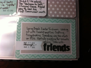
So, earlier this morning (when most normal people sleep), I posted my thoughts and process pics.  Today, because everything seems to be open on Easter, I have my CVS-processed photos!  So, this week is done. A whole week.  A whole double-page spread. So quick.


Well, that cropped a little weird, but you get the point.  This is the whole DPS.  Can you tell I am loving the color scheme?  Yeppers.  Here are the individual pages:


I took a closer pic of this so you can see something I plan to correct next week.  With my border overlay, I did not allow enough "bleed space" that is required when having your pics processed by an outside source.  If printed on my printer, the white border would not have been cropped so close, especially on the right edges of the photos (check out the digi sample from my earlier post).  I was curious as to how close I was cutting things, and now I know.  Next week, I need to bring it in a bit.  However, I am uncharacteristically NOT having them reprinted, nor reprinting them on my printer.  They are what they are.  Growth!  Who knew I was capable?  Hee hee.


I bid adieu to my Spring Break today, and wish a Happy Easter to all!  I probably won't be posting as frequently, but I would like to get my weekly shots up regularly.

So, how does this Project Life thing work?

It's been fun conversing with my buddies, both in the flesh and virtually, regarding what we want to "do" with our Project Life purchases.  A couple of interesting things have surfaced.
Those of us who are "old school scrappers" find the repetitive nature of the cards to be limiting.  We had to remind ourselves to expand our creativity as far as we wished---use embellishments and letter stickers and such.
  • The last time I did PL, I worked with entire double-page spreads.  This put the "creativity pressure" on me to make them cute or dramatic...definitely unified.  This time, I am attempting a Project 365 picture-a-day.  At first, I thought, "I have lost my mind!"  However, it has freed me beyond belief.  The unity comes in the random nature of the photos.  It's just...life!  If I see something that deserves more than that, I will expand it to its own page.  
  • Those who are newer to scrapbooking look at this and are a little intimidated.  We have established that some monthly "Project Life" dates will be needed (and fun!).  However, as a seasoned PL-er, I know exactly how easy Becky has made this, and, with a little help, the newer scrapbookers will get the cadence with very little instruction necessary.
  • The journaling is also intimidating to newer scrapbookers.  That's where the wordless or practically wordless cards come in.  Look cute with no pressure!  I have a sample below.
  • I am not using my printer, if I can avoid it, for photo printing.  I learned that fading occurs over time, depending on the ink, the paper, the storage area...so many variables.  So, I am sending a week at a time to CVS.  Why not wait until I have 50 photos and get the "deal?"  Because we are talking about less than $3 a week for photos that I know will last.  Also, I need the more immediate visual of my page.  That means some planning that is different from normal.  I took some pics of the process rather than the finished product for those who need to see a way to attack this.
I felt like the journaling needed to take precedence.  I cannot recall what day of the week it is, much less what happened on that day.  So, I did the journaling first, knowing what pics I would pair up. I put Post-Its in the areas where I wanted certain photos.


Note the divider.  A. I love chevron, therefore, it was an automatic score!  B. I love that it was not month-dependent.  I am starting at the end of March, so the divider says "March-April."  You don't even need to use it to state months.  Brilliant to keep these blank, Becky!


Journaling need not be paragraphs of correct grammar.  It is about thoughts.  I like the addition of cards that allow you to jot a few words about the photo.  I also appreciate the small nature of the cards.  If you have more to say, use the folded cards.  Or, you might see in the future my branching out to little flip pages that I have seen on Pinterest.  I used the date stamp that was included with the original PL a few years back.  These are also available at office stores or craft stores.


An anchor is important to me.  I like the larger cards with several lines where I can do a brief summary of the week.  I might not do this every week, but the option is there.

Here is a sample of a treated photo.  Now, if you are new to photo documenting or scrapbooking, do not make this your goal.  This added time to the process for sure.  However, I wanted to allow you to see how I was connecting pictures, dates, and journaling.


I did not put the dates in a consistent place, because sometimes the white would be on top of white in the photo.  I am OK with the inconsistency.  That's huge for me to even type. :)

When I get the photos, I will show the whole shebang.  

Friday, March 29, 2013

Project Life, Edition 2, Begins

Oh happy day! Look at what came my way today!


Quite hard to contain my excitement.  Of course, I broke in the Cameo.  What a beautiful machine.  Truly.  I only experimented, nothing major.  But I tell ya.  Instant love.

I spent most of my evening working on my cover page for Project Life.  You may recall that a few years back, I participated in the original launch of PL.  If you thought I was excited then, you have NO idea how excited I am now.  Back in 2010, Becky Higgins started with one album kit (now called the Cherry Edition) and an idea: make archiving life easier and more accessible to everyone, especially working moms.  The kit came with page protectors, journaling cards, title cards, a date stamp, and an album.  The cards were printed on one side, unless they were the folded journaling cards.  I loved the album, and I cranked out a ton of pages.

Now, Becky's idea has, well, exploded like Mt. St. Helens.  She has many, many styles to chose from, the introduction of mini albums, page protectors for vertical AND horizontal orientation, and everything is pieced out.  She has partnered with American Crafts, and not has a line of pens (which I purchased and have already fallen in love with) as well as the partnership with AC Digitals, which carries her many designs for PL in digital format.  The album set I purchased is called the Blush set.  I also purchased the AC Digitals Midnight album graphics.  I love the chevron nature of the Blush album, and most of the colors and graphics are up this girl's alley.  However, some of the cards just are not.  So what follows is a hybrid version of PL, and I am super excited to share.


Part of this layout's concept was borrowed from this wonderful cover page I pinned on Pinterest.  I loved how she used individual pics of her family members in the 3 x 4 spaces (which, if you are doing this, size your cards to 2.9 x 4...that's what actually fits in the sleeves).  I found a file with a rounded .png frame and recolored it to white (I will figure out how to create these on my own, but for now, HELLO Internet!).  I used Petunia Bounce font to write the names on each pic.  This will probably be the font I use throughout, as I love it so.  I treated the photos using Rad Lab.  I pledge my Photoshop neophyte love to this filter arrangement.  Do check it out if you are not so sure how to treat your photos to make them print beautifully. And yes, there's an app: Pic.Tap.Go.  I used the full fledged Rad Lab as I took my pics with what I lovingly call "Bertha," my Nikon D60.  My pic was snapped by my 16 year old!  Yeah, Ig!


The "bits & pieces*" card came with the Blush cards and is recommended for the first page (it's printed on the back of the card). I hemmed and hawed about this one, but I really like it as part of the finished page.  The card beside it is from the Midnight Edition.  I typed in "Three Hundred Sixty-Five, Two Thousand Thirteen, Two Thousand Fourteen."  Yup, I am going to try to do a photo a day.  We shall see how ambitious that might be.


On the bottom of the page, I used some cardstock from the Midnight Edition.  I cropped it to 4 x 6 in 300 dpi and found the parts with sayings that really fit best.  Then I printed on white cardstock.  The last card was part of the Blush Edition and is recommended for the first page.  I added some Amy Tangerine Thickers (recent purchase!) with our family name.  At first, I left it blank, but I felt the name was important.

Whew.  Can you say "overthought?"  From this point on, I am hoping it's not going to take me this long.  The title page is always my tough area.  I tried to get some yellow in, but it just did not blend.  Love the gray and blue.  It works well for me. :)

Monday, March 25, 2013

HSN and Unexpected Spring Snow

Little did they know that...

a) it is Spring Break for many a teacher-crafter

b) Central Illinois was getting 9 inches of snow thus keeping many of us homebound

...or did they?

Who is the "they" of whom I speak?  Home Shopping Network and their band of wallet-sucking bandits, that's who.  So, yes, I purchased the Blush edition of Project Life, and the Project Life Pens.  The pens were not a "splurge," I sure did need them.  Then, low and behold, they were selling the Silhouette Cameo.  The what?  This...
And you could spread out your payments interest-free.  The price was not necessarily better.  Just the idea of not plopping all the money down at once.  

Let is not forget AC Digitals, the company that decided that they should offer a sneak peek at the Midnight collection in digital.


So now that I am broke, I thought I should actually craft!  So, I wrapped up a page in my Ali Edwards One Little Word album.  Recall that my word for this album is "strength."  This page contained nine different song quotes that in some way related to my word.  I mixed stamps and my own writing, and copied Ali's design a great deal.  I pulled out some Hero Arts and Making Memories alpha stamps and remembered why I fell in love with them all over again.  I also tried to keep the red theme going throughout.


My choices:
1) raise your glass if you are wrong in all the right ways  ~Pink~
2) I am beautiful no matter what they say words can't bring me down  ~Christina Aguilera~ 
3) better stand tall when they're calling you out, don't bend, don't break, baby, don't back down ~Bon Jovi~
4) we will run and not grow weary, for our God will be our strength ~church hymn "We Will Rise Again"~
5) set up high I'm strong enough to take these dreams and make them mine ~Creed~
6) I get knocked down, but I get up again, you're never gonna keep me down ~Chumawamba~
7) don't give up ~Peter Gabriel~
8) baby dry your eyes, save all the tears you've cried, that's what dreams are made of, 'cause we belong in a world that must be strong  ~Van Halen~
9) smile though your heart is aching  ~Nat King Cole~


This Just Purchased

Yes, indeed, I am leaping back in to Project Life.  One word: Chevron.  Three letters: HSN.  Despite my multiple, unfinished projects, I shall be getting the Blush kit here in about a week...although the reality of working on it will probably not surface until May when a LOT in my life has died down.
I also bought the Project Life pen kit, as I am in dire need of some good journaling pens.

I need a twelve-step program.