Monday, February 18, 2019

See, what had happened was...

I was minding my own business, admiring some cards, when I happened upon this current trend (or pendulum swing) of shadows on die cut sentiments.


This reminded me of when I started considering buying sentiment stamps.  "I can write that myself," I said.  "Why would I buy a stamp?"  I soon realized that sometimes a stamp is quicker, cleaner, and more convenient.  But not cost-efficient.  One stamp makes maybe three cards unless you are in mass-production mode.  But we (yes, "we") get caught up in the cuteness factor, watch a Jennifer McGuire video, and suddenly need "all the things."

Lately, I have decided that this cycle is ridiculous.  Case in point: Concord & 9th has a turnabout stamp concept that is ingenious.  However, there are things that they have decided are important must-haves that they did not conceptualize before production.  Now, they are trying to sell things that make using the stamp set easier.  The stamp set, mind you, that cost $24 to the average crafter.  Now buy these two other things as add-ons?  Nah.  Or the wreath builder from the wonderful Gina K.  While I purchased the original wreath builder, I have since cut several different sizes of it on my own with my Silhouette Cameo.  It's two squares, people.  For real.

Back to the shadows: When I saw some of my favorites using shadows with their sentiments, and when I was ever so close to buying some of them, an epiphany hit: Hey, JoLynn.  You can make these.  And the tinkering began.  Please forgive these photos.  In my excitement, I literally did not wait for the glue (which dries clear) to dry.


First, I wanted to get a serif font look going on like my girl, Cathy Z.  Two things: kerning and cut blade.  I did have to go in to Photoshop to get the letters as close as I wanted.  The Silhouette software had its limits.  Second, I used a pre-cut that was in the Silhouette Studio software.  The white paper did not have as smooth of a cut as I would have preferred.  And, let's just say I need practice gluing a sentiment to a shadow.  It's a little wonky, but a good prototype.


Then came this beauty.  I was like, "Hmmm, let's use some script fonts."  A couple of tutorials later, and voila! Script font, with shadow, and a smooth cut after some tinkering with blade depth.

So, it may be completely real: I might never buy a word die again.

Sunday, February 17, 2019

Apparently, I like rotations


Today's card is brought to you by the Concord & 9th Retro Petals Turnabout Stamp Set.  I was inspired by this card, which uses the stencils for this set (which are on their way from SSS).  I was also inspired by the recent offset shadow word dies I have been seeing.  This is my first shot at designing one with my Silhouette.  I plan to play a LOT more with this idea.  

Interested in the Turnabout stamps?  There are some things you must set up, but once you do, it creates a great background.  I am not a fan of all of the designs, but I like this one a lot.  Again, I will get braver as time moves on.

Wednesday, February 13, 2019

Tuesday, February 12, 2019

Stamp Platform Drama

If you have been actively buying stamp accessories in the last two years or so, you know that a revolution for perfection has taken place.  We now have the technology to stamp images well with very little error.

Stamp presses were definitely a rage I fed into in the 2000s.  Thank you, Fiskars and Martha Stewart.
Easy Stamp Press   Image result for martha stewart stamp press

Then the MISTI came out.  Just a gal trying to make large stamping jobs a little easier.  I am grateful, My Sweet Petunia, for your forward thinking.


Image result for misti stamp platform


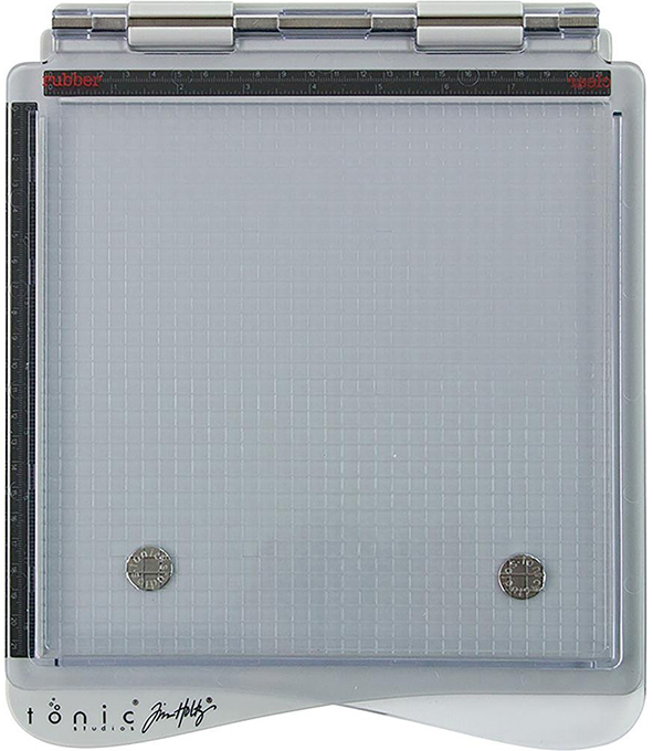
The creator of the MISTI has a couple of US patents on it.  The design is a smart one.  And, of course, people tried to jump on board.  Some made COMPLETE knock offs that looked so similar, you would feel you needed to buy it off a truck somewhere.  However, Tonic and Tim Holtz came out with this bad boy.

Image result for misti stamp platform
I was using my MISTI, and having some minor inconveniences with it.  I have had it for a while, one of the plastic hinges was cracked, and I think the use of too thick bar magnets was taking its toll on the design. Still, I paid over $60 for it.  I was not about to buy another one.  The largest one is available for a mere $100.  Do you know how many stamp sets I can get for $100?  Not happening.

I read about the designer of MISTI suing Tonic and Tim Holtz.  I of course became intrigued.  Law suit = something to be sued over.  So, I ordered one.

There are approximately a gazillion videos that compare these two products.  I am going to lay it out for ya right here:

Tonic redesigned the stamp platform.  They took it and made a superior product. It wasn't a carbon copy.  It was SO much better.  I make less mistakes, have to restamp a WHOLE lot less, and I can use all sorts of sizes of paper.  It's made of better materials. And, it was less than $40.  The travel size is available as well which is even less.

Tonic amicably settled with My Sweet Petunia, and agreed to pull the product from the North American market.  They wanted to show support for small business.

This whole thing has me a bit bewildered.  Quite frankly, I am a little sour about it.  I see redesigns of products to make them better as technological growth.  I feel that Tim and Tonic did not steal the design...they remade it out of better products and made something that worked better.  I know it took them a year to finally settle.  I imagine there were all sorts of conversations. But I have a bad taste in my mouth right now toward the MISTI and its manufacturer.  Give her some of the profits for having the patent?  Sure!!  Take competition off the market?  Hmmm.  Not sure.  Now, My Sweet Petunia is suing Stampin' Up because of its Stamparatus, which I think is also markedly different from the MISTI.

I will state here and now that My Sweet Petunia was wise in getting a patent for its product design. But I hate to see innovation squashed because of it.


Sunday, February 3, 2019

More Mandala Cards

Kim and I got together so she could finally break in her Gina K Wreath Builder templates.  She did great!  Here's my slightly remixed version of a Pinterest-inspired card.


Truth be told, I took it one stamp too far and the center was wonky, so I ended up cutting it out and putting a heat-embossed sentiment beneath it.  The inspiration card used a dark pink, which I neither had nor wanted to use, so Kim chose SU! Wisteria Wonder, which was delightful.  I started with a little Lawn Fawn Hippo ink, but moved to Wisteria Wonder as well.  We also used Gina K's Amalgam Black.  The sentiment it by the talented Dawn McVey for Papertrey Ink.  The mandala was made with Mandala Maker stamps from Gina K.  I believe the base is Wisteria Wonder...or it's close enough that it looks good.


The inside sentiment uses Lawn Fawn Hippo ink and a Papertrey sentiment.  Kim and I both decided that sympathy cards are some that are always low in our stash, so that is what we decided upon.


Not a huge fan of this card, but I'll show it anyway.  I was going for this color combo.  I feel like it was a near miss. I am not sure I am loving Gina K's black embossing powder, but it could have been user-end error.  The sentiment is from Simon Says Stamp.


My MISTI and my SU! inks and my wreath builder were not getting along, so this card took forever.  I needed to start the images a little closer to the center, which you live and learn with the wreath builder.  I used SU! Pear Pizzaz at first, then changed to an Ali Edwards ink because I think my ink pad needed a refresher.  I just could not get a solid image, and with the repetition required, that adds a lot more time to the project, not to mention that if your paper moves in the slightest and you have to reink, you're done.