Tuesday, June 30, 2009

Color Challenge before sleep

I made the mistake of going to see what the color challenge was for today: Kraft, So Saffron, and Night of Navy. Loving this combo, I stayed up just a smidge longer and made this card.

I have had SU! A Light Unto My Path for a while. Since this color combo made me think of Nautica, I decided it was time to use the lighthouse. The verse is one of my favorites, too, for an extra added bonus.

I started by looking at my chipboard, since I am a chipboard hoarder (say that three times fast!). When I found the set of chipboard with different tags, I knew I wanted to use one of them. A sentiment was the first thing I thought, and then it hit me that using it for a spotlight would be awesome as well. And thus, the idea took on a life of its own. I must say that Night of Navy takes very well to unfinished chipboard elements.

How to "tether" the sucker became a whole different story. Luckily, I remembered that I had some wired paper cord that worked well. I anchored it with some brads, and volia! The card took no time at all really.

I love that I stamped the lighthouse on textured paper. Purely coincidental, but it gave the image a rustic feel that really brings something to the card, I think.

Size: 4.25 x 5.5"
Paper: SU! Kraft, Night of Navy (textured), So Saffron (textured)
Ink: SU! Night of Navy
Stamps: SU! A Light unto My Path
Accessories: Paper Wire, Spare Parts brads, SU! chipboard

Monday, June 29, 2009

Sparkle!

OK, for those of you who watch HGTV, you will totally understand where my mind went when I saw that this week's Clean and Simple challenge was to use sparkle on a card. If you watched Design Star last season, you know who was thrust back into my mind like a bad 70's perm...SPARKLE JOSH! Shown here with Kim Kardashian, Sparkle Josh was known for his thrift store flair and his ability to, well, add "sparkle" to his designs. Since there were two men named Josh on the show, he decided to give himself the name "Sparkle Josh" so they could be told apart (yep, UNnecessary).

OK, enough tangent! Now onto the challenge. I love the Clean and Simple challenges because I can stop where I usually want to stop. I have been wanting to use these stamps for the past two weeks, but just haven't fit them in to a project. How perfect since AMuseapalooza is getting underway. I am a constant user of this somewhat jaded phrase, so when I saw a stamp with it, there was no hesitation before buying it.

This card went through several transformations. At first, I had several circle punches out and was trying to layer. It quickly turned into a Dirty and Complex card, so I scratched it. I knew I wanted to use Kraft and black, and I was trying (badly) to incorporate white so my sparkles could jump out a bit more. I settled for inking on the Kraft.
My sparkle for the card was created using Spica markers. I colored "da bomb" with black and yellow, and I outlined the words with yellow. I underlined "bomb" with black Spica. It's a lot more sparkly in person.


Card Size: 4.25 x 5.5"
Paper: SU! Kraft, black
Stamps: Bomb and Da Bomb! from A Muse
Ink: SU! Basic Black
Markers: Spica

Sunday, June 28, 2009

Featured Stamper: Dawn L

This week's SCS Featured Stamper has a great gallery. It was very difficult to choose from all of her fantastic pieces.

I was particularly inspired by some of her earlier posts that included watercolor paper. I got some watercolor paper with an Archiver's coupon well over a year ago, yet was too big of a chicken to try it out. Dawn's Spring Watercolor gave me some inspiration, mainly because she put some steps in with her post. This being my first dabbling with watercolor paper in my cards, you will notice I stayed fairly close to her design... just barely a CASE. She used one of my favorite sets, SU! Spring Garden, so why stray?

This card is for a family who hosted a church gathering for some of us today. We have such a huge parish that we are broken into "zones," and this was a meet-and-greet for our zone, the first of many (I hope). We spent a lot of time in their yard, so I thought the theme of the card was very appropriate.

Card size: 4.25 x 5.25"
Paper: SU! Kraft, Archiver's watercolor paper, SU! Blue Bayou
Stamps: SU! Spring Garden, SU! Many Thanks, SU! Simply Said (inside)
Inks: SU! Lovely Lilac, Certainly Celery, Garden Green, Almost Amethyst, Bordering Blue, Perfect Plum, Blue Bayou, Chocolate Chip
Accessories: small paper flowers (very old... no idea where I got them); Spare Parts brads
Also used: blue and green crayons; water bottle; Aquapainter

Me

I am so excited! Registration opens July 1 at 10 AM PDT for Cathy Zielske's new class for Big Picture Scrapbooking. It's called me the abridged version, and, I don't care if it completely stinks, I shall take part for several reasons:

A. It's Cathy, and she's hysterical.

B. It's Cathy, and she's a great designer.

C. It's Cathy, and I took her Design Your Life class and loved it and got LOTS of pages done.

D. She has a wicked cool video for it... seriously watch it at this site.

Saturday, June 27, 2009

I went there...

Today's inspiration challenge was definitely a challenge for me. We were to take the artistic work of Sarah Collier and use it as our inspiration for a card. As I looked through her gallery, I realized she was a genius at collage, particularly taking seemingly unrelated images and layering them into a single piece.

I was inspired by her works relating to musicians. My favorite work, was this one of an aging U2 I. I love the sheet music as a layer. She created a similar look for the Stones and the Beatles.

I have resisted collage, mainly because when I try to throw things together and make them look like one piece, my finished pieces tend to look too intentional... not haphazard enough. I looked at the SCS Challenge this morning and really let it brew all day before I knew what my inspiration would be.
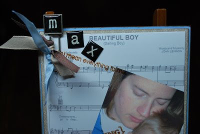
Back when I first saw the movie, Mr. Holland's Opus, I was touched by its portrayal of Mr. Holland's acceptance of his son's hearing impairment. When he sang the song, Beautiful Boy, by John Lennon, to his son, I remember tears just falling down my face. What a gorgeous song to write for your child.

So, today's card blends that song with a favorite picture of Max and me. I will probably end up using this for a scrapbook page hidden journal. We waited so long for Max and almost gave up on him coming in to our lives. I can bond with Mr. Holland and his road to acceptance of what his son's "normal" would be.

If I could alter any part of the card, it would be to make our photo a bit more transparent. But, for a gal who's wary of collage, I think I done good. :) I think I will even duplicate the idea for Ignatius and for Scott. Hmmm, which songs suit them...?

Card size: 4-1/4 x 4-7/8"
Cardstock: SU! To the Nines DSP; SU! Bashful Blue
Stamps: SU! Always
Ink: Color Box Chestnus Roan (for edge distressing); Tim Holz Distress Ink Vintage Photo
Alphabet: Spare Parts Alpha Chips
Ribbon: SU! Chocolate Chip twill, Kraft taffeta, and Bashful Blue taffeta
Sheet Music: Music Notes.com

Friday, June 26, 2009

Triple Play Revisted

Before I get into the cardmaking of this post, I had to share a photo of my morning craft partner. Max was very interested in stamping this morning. He used multiple ink colors, and grew appreciative of why Mommy insisted in cleaning the stamps between colors. He even wanted to try his hand with the scalloped oval punch. {Tear...sniff...tear}

Now, for today's card. It's been a long time since I combined SCS challenges, and today felt like that day. So, here's what inspired this card:
SCS Sketch Challenge 234 (shown): I think my rectangle panels were a little large, but I went with it anyway.

SCS Ways to Use It Challenge 224: Use bold and bright color elements. Whenever I break out red cardstock and patterned paper, there's no way around this.

SCS Limited Supply Challenge 226: This read like a menu from a Chinese restaurant. We had three areas from which to choose one part. I chose:

Menu #1: Neutral images (a medallion that hinges on floral, but I think it stays true to the spirit of the challenge.
Menu #2: Reds/Blues. This was definitely challenging for me, as I have plenty of blue expertise, but I use red sparingly.
Menu #3: Well, I guess it says ribbon and brads, but I really didn't want to dink with ribbon... I had a hard enough time deciding on brad placement.

Card Size: 4.25 x 5.5"
Cardstock: SU! Bordering Blue and Real Red; white
Patterned paper: SU! Ski Slope (Winter Mini)
Brads: Spare Parts
Stamps: SU! Baroque Motifs and Great Friend
Inks: SU! Bordering Blue and Real Red markers


Tuesday, June 23, 2009

CC224: Friend Tree


Today's SCS Color Challenge was to use Pacific Point, Tangerine Tango, and Summer Sun. It took me quite a lot of time, not to mention paper, to come up with a final outcome. However, I kind of like it.
The card measures 4.25 x 5.5"and is mounted on white cardstock. After the base, there is a layer of Pacific Point, and then a layer of SU! Jersey Shore DSP. I used SU! Brilliant Blue for the sentiment, from SU!'s Great Friend set. I stamped it and then punched it out with the Curly Label punch. The layers behind it were cut freehand. The inner panel is a layer of Pacific Point, a layer of white, and a layer of Jersey Shore. The ribbon goes under the inner panel. There is also a strip between the white and the sentiment.
The tree was an afterthought. I actually created a separate card, with the tree to the left and a whole lotta white space to the right. It felt really off balance, but I had worked hard on that tree. So, I cut it out and made it the focal piece of a new card. The tree is from SU!'s Season of Friendship set. I stamped the tree in Chocolate Chip and the leaves in Summer Sun. I paper pieced some of the leaves for more dimension.

Monday, June 22, 2009

Jessica Sprague

Just a shout out moment to Jessica Sprague. She is offering a free workshop on photo editing. It will cover frames, masks, and special effects.

Did I mention it was free? So yes, I am taking it. I can't wait to learn more.

Clean and Simple Thanks

Today's Clean and Simple challenge was paper piecing. My middle name, yes?

I paper pieced the wrench from SU!s Totally Tool. I stamped the wrench onto metallic silver paper using StazOn, then I cut it out and adhered it to a 3.5 x 3.5" card base of SU! Not Quite Navy textured paper. I used some Walk in the Park DSP scraps I had from recent cards that I used for one of my layers. The other layer unites the metallic feel of the wrench via jumbo silver eyelets. I thought some twine would make a pretty cool look to this very manly card. I also rounded the corners with my corner rounder.

Sunday, June 21, 2009

Features Stamper 124: Christy S

Now that summer has officially begun, I am trying to do at least one card challenge each day. We'll see how that goes, but it does feel good to be in full swing with that again.
As we look down the barrel of another Monday, I thought I would make a card that gives me a laid back feeling, if possible. This next week is not very busy at all, which is... fantabulous!

Christy S is this week's featured stamper. Her card, Living Large (shown), is one I chose to CASE. I loved the layout and the clean and simple style of this card.
I chose to change her card in several ways. I decided to use patterned paper rather than solids, with the hope that it wouldn't draw too much from the layout. I have a solid kraft base, layered next by SU! Bella Birds DSP. On top of that is a layer of SU! Not Quite Navy, and then another pieced layer of the Bella Birds, the flipside of layer 1. My spabella stamp is in the oval, which is backed by more Not Quite Navy. My oval is a lot more predominant than Christy's, mainly due to the image, but possibly because my card itself is a little smaller than the typical 4.25 x 5.5".
To make the sentiment pop a bit, I popped it up on dimensionals and to tie in layer 1, I put more of it behind the sentiment. Also, I paper pieced her robe to match the DSP.
Fun! I just want to carry it with me all the time. Maybe I shall!

Friday, June 19, 2009

Once Upon a Shoe Bugaloo


Saturday's inspiration challenge from SCS asks us to look at the Bugaloo website. I chose these shoes for my inspiration.

At first, I was looking for what would help me use my stash left over from the invitations I just finished. The color scheme for these shoes helped with that. I love that we are dealing with leather, and texture, and stitching, so I tried to incorporate the feel of each.

For this 4.25 x 5.5" card on SU! Chocolate Chip cardstock, I used some of SU's Walk in the Park Designer Series Paper from its Occasions mini-catalog as my first layer. I liked how, in the inspiration piece, the leaves were cut out to show the layer underneath. Knowing my low-level craft knife skills, I chose paper piecing the leaves on the tree and the wing on the bird to match this base, rather than trying to cut out a window for very small parts.

I chose to use Cornish Heritage Farms Pretty Birds from the Kim Hughes Collection. I love the play on words for the sentiments. I chose "Somebirdy Special," deciding to make one of the birds differ from the rest. I tried to give him a shadow, too... I have to work on that a bit more. Looks like he had a little accident. :)

For shading, I used my Copics: Cool Gray, Pale Blue, Burnt Umber, and Atoll. For stamping, I used SU! Chocolate Chip. For faux stitching, I used SU! Close to Cocoa marker. I paper-pieced the limb, the leaves, and the stand-out birdy. For the So Saffron layer, I embossed with Cuttlebug's Stylized Flowers folder.
I think it's pretty cute.

Craftiness on Crack

OK, the first thing you should ask when someone wants you to make wedding invitations for them is, "How many do you need?" I asked this way too far in to the process, and I got the answer of 200.

At first, an air of tedium enveloped me. Despite my OCD nature, assembly-line type activities are not appealing. However, as of late, I have actually enjoyed completing them. It was a brainless quiet time that gave me some satisfaction, albeit delayed.

So, as of today, the 200 invitations with their three layers each, one of which was embossed, their matching response cards, and their stamped envelopes are all finished. They will be delivered on Monday. Here is their story.

The specifications I got from the bride indicated that her colors were watermelon and canary, a la David's Bridal, and that she was going to inject daisies into that mix as well. I knew the watermelon would have the ability to take over the invite if allowed, so I tried to keep it at bay.
I found the watermelon metallic paper at Scrapbook Friend'z, as well as the initial color of textured canary cardstock. Alas, the canary color was in a few different hues, as my order of paper was delayed from Friend'z, and I found myself scrounging colors as similar as possible. It all worked well because the canary was embossed with Cuttlebug's Stylized Flowers embossing folder and was then layered between the watermelon metallic base (5 x 7") and the translucent white vellum top layer (4.75 x 6.75"). On this layer, I sampled (via MS Publisher)the watermelon color from the David's Bridal site and used that as the ink for our script.
The script I used was French Script MT. The type style for the response envelopes and for part of the response cards was Candara is all caps.

I used Jolee's Daisies vellum stickers, and let me tell you, thank God for eBay. They only came six usable daisies to a package, so I had to order a boatload (well, 34 packages) of them. I found them from various eBay vendors for well below retail and reasonable shipping. I originally found them at Meijer, but they were $2.99 retail. I got them from eBay for about a dollar less per package on average.
I have to also give a shout out to LCI Paper, whom I found online. Great envelopes. Great prices, delivered exactly when they said they would be.

The response envelopes were a bit frustrating. I could not program my printer to take them (a little larger than 3 x 5"), so I ended up printing the response address on clear labels. When the labels were on the envelopes, they looked so plain, and, quite frankly, slightly off center (I think I loaded them wrong in the printer). So, out came the stamp!

I started by stamping the small flower from SU!'s Simply Said set in SU's So Saffron. I stamped it twice next to the address, and three times on the back flap of the envelope. Then, it appeared that there was a disconnect with the stamping, so...

Yes, you are correct. I stamped on the other envelopes as well. The inner envelope has three small flowers where the names will be written. The outer envelope has one flower on the flap (it's a V flap) and three in the lower left-hand corner of the envelope.

So, I finish tonight, and I start cleaning up my area, which has been a train wreck for a couple weeks due to this work in progress. What do I find? Another set of response envelopes! Man, when you think you are done, and a pack of 25 envelopes pops up out of nowhere, it can really throw you for a loop!

Now, I really am finished. They need to be stamped, labeled, and sent, and I believe the bride and her party will have the fun with that part.

Total cost: about $425 for materials.

Saturday, June 6, 2009

I Won!

I never win anything. Ever! However, I won a prize in The Scrap Review Raffle. On Thursday, I won the Lil Man/Snorkel Double Deck by Cosmo Cricket. I'm so excited!


Today is Super Saturday, and, I must say, HOLY COW. Great, great, great big prizes. Lookie:
Tickets are $2 each. You can't specify which item for which you want a ticket. You pay via Pay Pal (or e-mail The Scrap Review).

This is the last day of their raffle. This site explains the purposes of their raffle.

Tuesday, June 2, 2009

A new Cathy Z class

Hold onto your hats, fellow scrapbookers! Big Picture Scrapbooking is hosting another class led by Cathy Zielske. The class, starting in September, is called All About Me. Now, I am a little leery, as I just finished my All About Me Lisa Bearnson album. That was different, though. Very prescribed. This class sounds a little more open to interpretation.

If you want a little taste of the type of work Cathy does, click here. She's hysterical, and I love her very linear design style. She also has great ideas for what to scrap about that I, myself, would not have thought up.