Wednesday, December 30, 2009

A Challenge

I was in need of one more birthday card. I saw that Ann was hosting the latest challenge at the Everything But the Kitchen Sink Challenge. Perfecto!

The challenge included the use of wrapping paper. I pulled out some of my Martha Stewart Confetti wrapping paper from EK Success for a birthday card for my grandmother's 97th birthday. I wanted to stay simple and let the pattern speak for the card. So, I decided to use my SU! scallop circle punch and the idea of repetition. I stamped the Happy Birthday sentiment from the SU! So Many Scallops set using the method of coloring the stamp with markers (SU! Yo-Yo Yellow, Old Olive, and Going Gray). I punched that and then punched several shapes from the wrapping paper.

To give dimension, the sentiment and one of the other shapes is popped up on a Dimensional. I had to back the wrapping paper scalloped circle with cardstock because it was too flimsy alone to be popped up on a Dimensional. I inked the main panel (SU! Going Gray) and the scalloped wrapping paper shapes with my Going Gray marker. For three of the scallops, I added some corduroy brads. I mounted the Going Gray panel on to some Georgia Pacific white cardstock.

Simple. Doable. I like it.

Tuesday, December 29, 2009

Two-card Tuesday

Hey, I might have to make this a habit. It's a catchy title.

Today, I had some of my crafty ladies over, Ann and Karen. We had one of those, "We should get together and craft over Christmas break," discussions, and it actually happened. Yeah us! Later, our friend Jessie brought over milkshakes. Yeah squared!

But, I digress. I had an idea that we should bring a scrap of paper for others to make cards. You know you always have a scrap laying around somewhere. Ann brought over this cute SU! patterned paper from the Pink Flamingo collection. The red floral part is actually the flipside of the yellow floral. I went with the idea, originally, of staying monochromatic. Then I felt some green (Color Box Olive Pastel) ease into the act to edge the circles. It was all flat circles until I saw Ann mass-producing these cute circle flowers, and I knew I had to try one. I have no idea where the button came from, but it seemed to fit just fine. I also inked the edge of the outside of the card with the Olive Pastel and stamped the sentiment (SU! You Make Me Happy) in the same ink. This card makes me happy, especially since I used SU! Summer Sun cardstock on a wintry day.

Yes, I made TWO cards. That's what happens when I hang with these people. I decided to use the other half sheet of SU! Summer Sun cardstock. I had gotten the paisley (Traditions Floral Paisley from The Paper Studio) out for my other crafters and ended up using it myself! I liked that it had a hint of the yellow in it already, and I accented with some SU! Basic Gray. I also used my Fiskars scallop blade to add some fun along the edge. I do not know where I got the ribbon, but I think it matches quite nicely, though I was tempted to use a little Basic Gray taffeta. The sentiment, stamped in SU! Craft White, was from the SU! On Your Birthday set. Making this reminds me to get some cards out to my January 2 birthday relatives! I am always late with those!

Monday, December 28, 2009

Sew complex

Okay, well, I did complete several stitches. That's a good thing, Martha would say, yes? I can't seem to get the machine to make different types of stitches, but I threaded the needle and the bobbin and got it going... enough for today!

Questions remaining: What are the best settings for paper stitching? Why does the back of my stitching look awful? How can I get the machine I have to create different stitches (I turn the dial that I believe should change it, but that's not occurring)?

Tomorrow is another day...

Sew ignorant

OK, this break, I decided that having two sewing machines in my house and no clue how to use one was unacceptable. My smallest goal: to be able to do some stitching on paper crafting. My largest goal: make an article of clothing. My need: to figure out how in the h3#l to get the mechanism to do what it is supposed to do.

I looked for video tutorials, but, even though they said they were for "beginners," there was a lot of hidden lingo and assumptions. Plus, even though machines have similarities, they are not all the same.

My next step was to search Singer's site for the manual for my machine. Success! It is a free download... $15 if you want a hard copy. I did print it myself, as reading online while looking at a sewing machine is a bit challenging. Now, I am off to figure this out. More to follow.

Saturday, December 26, 2009

Winter Break has its rewards

Between yesterday and today, I finally had the "mass production" drive to get my Christmas cards finished and mailed out. I surprised even myself. So, after going to the post office, I decided a trip to Hobby Lobby to help my depleted adhesive stash was in order.

Lucky me, adhesive was 30% off. Also, there was a Tombo MonoAdhesive 3-pack refill for $10. Sweet. Was I honestly going to stop there? After all I had worked through? Of course not! After all, I still had the 40% off coupon in my wallet, and since adhesive was on sale...

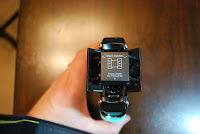
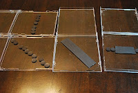
I came upon a We R Memory Keepers Crop-A-Dile Corner Chomper. I had seen Kristina Werner use hers on pretty much every video she does, and I like the idea of something that can round more than a piece of patterned paper. This is also a nice tool because it will cut at two radii, 1/2" and 1/4". I thought I would do some pics so you could see the ease of its use.

Step 1: Open the guides.


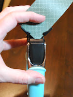
Step 2: Place paper in size you desire.


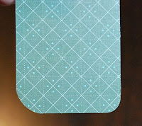
Step 3: Chomp. I show in this pic the differences in the rounding of the corners.


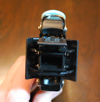
Step 4: Empty the waste bin. I love that it catches the corners!
Another find that I was excited about helped me to solve this issue:

I had storage "issues" with my Nestabilities purchases. For a while, I stored them in empty CD cases that had adhesive-backed magnets in them, There were two problems with this: 1. The magnets did not always hold, so the dies were not really secure. 2. I stored them in a place where it was a pain to take them out. Therefore, I did not use them as frequently as I could have. 3. They took up more room than I really liked, as I could only fit one set per CD case.

Enter the Quick Kutz Magnetic Storage Book (30% off today... woot woot). Take a peek:

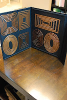
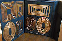
Yep, it's a magnetic book... slim... it closes... and I fit 7... S-E-V-E-N... Nestabilities die sets in one. It retailed at HL for $12.99. If you are familiar with Quick Kutz, all of those dies are small, thin, and metallic, so I think their organization/storage people deserve a raise for this one. Brilliant.

I also purchased some Thickers... yep... 30% off, too. I noted that The Paper Studio has their version of Thickers available, and they were cute, however, they were falling off the sheet as they hung there. Bad sign for someone wanting them to stick in a scrapbook.

Look soon for more postings by me. I want to wait until a few things I have been working on actually get to the people for whom they are intended before I post here. I am anxiously awaiting the Project Life kits from Becky Higgins. Can't wait to get going with that!!
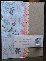
Tuesday, December 22, 2009

One World, One Heart

...let's get together and feel all right...

In an effort to make 2010 as crafty as possible, I decided to commit to the following. Got a blog? Join in! Thanks, Ann, for the shout out to this event. It's as hippie as this conservative girl gets. :)

Saturday, November 28, 2009

Cranking it out

I finally had extended time to work on my sister's scrapbook. Photos to come soon... after I know it's been delivered. Just didn't want it to seem as though I am doing nothing crafty. Au contraire!

Friday, November 27, 2009

Seriously?!

So, with Thanksgiving break comes the ability to waste a little time without feeling as guilty as typical. I hadn't been to Beate's blog in... forever... when something caught my "sparkling" eye. Seriously.

Check out the site. Oooh, man... this is a crazy set, but it involves Twilight AND True Blood, so it's a bargain, right?

Wednesday, November 25, 2009

Dude!

Lisa Bearnson is leaving Creating Keepsakes. Holy crap.

http://www.lisabearnson.com/blog/

Thanks to her for starting a magazine that I look forward to seeing in my mailbox.

Saturday, October 31, 2009

Peace


Last weekend, I mounted my "create" definition in my craft room, and Scott and I mounted the Thoughts & Prayers tree from Stampin' Up! in the dining room. We have been hemming and hawing about what sentiment should go with it. Today I took several plunges. First, I had never cut vinyl lettering with my Cricut. Let me tell you, it was like buttah. It was so easy I want to use it on cards and scrapbooks. Seriously. I also had not yet used my Jasmine cartridge for the Cricut. What a pretty script!

I cut out "Peace" at the 5 1/2 dial size, and I took "to all who enter here" to the 2 dial size. I used Provo Craft's vinyl and transfer tape. They say you can hang it without the transfer tape, but that would have been a recipe for disaster with this script. You have to line up the letters once you cut them out, and the transfer tape was indispensable in that task (as was my hubby's level app on his iPhone).

I really like this very much. When you enter my home, it greets you on my dining room wall.

Now, what else needs some vinyl...?

Friday, October 23, 2009

create


My first experience with vinyl wall-hangings. Let's just say that, if you want to experience these, choosing something with fine print is a challenge for the first time. It was much like a giant rub-on, and a lot of the same principles apply. You just have to have a patient hand. I was glad I bought the Stampin' Up! scraper, as that came in very handy. This particular wall cling is produced by Stampin' Up!. It's in my craft room above the bar and decorative hooks I purchased at Ikea. You can't really tell, but the cling is a chocolate color. They do not recommend hanging it on a textured surface, but it worked fine clinging to our wall, which has a texture. We'll see how it does in the long run.

Saturday, October 3, 2009

Still here

Life
making priorities
having fun
doing work
sleeping long
sleeping short
eating lots
widening pants
paying bills
laughing well
living much
now
and finally
getting my craft on
it's been lacking in
Life

Saturday, July 25, 2009

Paper Craziness

For months (yep, months) now, I have been involved in paper procrastination. I needed some reorganization of my scraps, and I just didn't know quite where I wanted to go with it.

I am happy to say, today was scrap paper day in the JoLynn craft room. Here's what I did:

- In 6 of my 2" craft organizer drawers, I have scraps of paper in the following categories:
~red and pink
~orange and yellow
~blue, green, and purple
~neutrals
~patterned paper
~card pieces (things that can be used as card parts)

I used to have these in large Ziploc bags, but that was not the most efficient use of space. I'm not sure this is, either, but it's a step up. Plus, in organizing, I also purged quite a bit that I knew I would not use.

-In one of my black cubes, I have a hanging file folder drawer. It used to be just for 8-1/2 x 11" cardstock in its entirety, but I added 5-1/2 x 8-1/2" cardstock to these files as well. I realized that I need another one of these drawer cubes, as this one is packed now.

-I filed patterned paper packs that were sitting around, too. These I keep in vertical Cropper Hopper (or Cropper Hopper-like) transcluscent paper organizers. These are housed in some of my black modular cube shelving.

Still on today's docket: finishing some of the shelf trays that I bought from Hobby Lobby ions ago. I want to Mod Podge them with patterned paper so they look a little cuter. Once I'm done, I'll post pics. I realized that it's been a while since I posted my scrapbook room in photos, and I have changed it quite a bit since it's debut on my blog. Time for an update!

Simply Sent: For You Phrases

Well, I broke down and purchased a Simply Sent kit from Stampin' Up. SU! started these kits a few catalogs back. Marketed for neophyte stampers, these kits come with everything you need for several really nice cards.

In the past, I liked one or two things about the kits, but did not like them enough to pay almost $50 for a lot of things I didn't need. This catalog's For You Phrases kit was one that had enough things that appealed to me that I found it was worth the cost.

Now I will say that I broke the kit apart to place materials where they fit in the organization of my craft room. But, in taking these photos, I can recall what came with the kit should I want to assemble the cards as suggested. I may try one or two that way, just to not recreate the wheel. In all, this kit gets two thumbs up from me! I have created captions with the slide show below so you know what you're looking at.


Friday, July 17, 2009

Shoebox Swap

One of my favorite things is coming up next week: a shoebox swap. Such a celebration occurs when a few of us get together and bring a shoe/craft box with materials for the participants to make cards. This blog entry is my teaser to my people.

Not that I wanted to be morbid, but I decided upon cards that people may not have a lot of in their stash... get well, praying for you, sympathy-type cards. I also have a growing pile pf perfectly good scraps that I tried to use as a limit. That worked fairly well, although I have to say I was not 100% "scrapped" in my creations.

Praying for You Card:
This card is mounted on a 4.25 x 5.5" SU! Basic Gray base. The next panel is a piece of textured paper in a sunflower-type color. The patterned paper is Bella Birds DSP from Stampin' Up! The sentiment (Thoughts & Prayers) and its frame (Great Friend) are also form SU! I found some very cool ribbon in my stash, and I had enough for about 4 of the cards. The others have a substitution of sheer white ribbon. I used a gray brad from Spare Parts to mount the sentiment. I used SU! Basic Gray ink and Going Gray marker.
Earth Has No Sorrow Card:
This card is mounted on a 4.25 x 5" Kraft cardstock base. The three layers of SU! DSP are punched with the SU! Scallop punch and then inked with the SU! Going Gray Marker. I think the DSP is from the SU! Spring Mini-Catalog... I can't really remember. Faux stitching was added to the top panel as well. The sentiment panel was stamped and inked in Cameo Coral using the Close as a Memory set. I then added a square piece from Tim Holz Fragments. I Mod-Podged this to a piece of the top panel of DSP, and then I cut and sanded around the sides. It is affixed using Memory Mount.
The box shown gives a little idea of a way to organize for a swap such as this. I took a cue from Karen and put most materials needed in a Ziploc bag. This helped me with knowing whether or not I had enough materials for all participants. Other, more general needs are just placed in the box. I am so excited to see what cards my buds make!


Saturday, July 11, 2009

Jessica Sprague: Textures

The theme for Day 5 was textures. This photo was taken last November when the snow fell on my pumpkins. While there was enough "concept contrast" in the photo already, I decided to play with this photo and adding textures.

First, it's easiest to desaturate the photo and start with a black and white or somewhere close to it. Then, I added three .jpg files as layers. Each time, I chose "soft light" for the layer, which gives the layer a translucency. The layers alone looked like: a crumpled up brown paper bag, a piece of slate, and a really old, battered photo in clear plastic photo corners. Click on the photo to get a better view of the textures.

Friday, July 10, 2009

Jessica Sprague: Clipping Masks

This picture used a clipping mask in Photoshop. It was really quite easy, but I definitely needed instructions! The Grunge photo mask used was created by Jessica Sprague.

Jessica Sprague: Colorizing

For this activity, our exercise was to colorize a photo, giving it a vintage feel. The toughest part to this was finding a photo that would really lend itself to the colorizing. This is the third photo I chose and the only one I actually felt turned out a bit on the side of "vintage."

Basically, we learned to manipulate the hue/saturation layers in Photoshop. We created some sharper colors and better contrast with our photos. Then, we created a layer that added some sepia to the mix. We then took to using the brush, which was the part that I could use some... well, "brushing" up on. I chose to colorize Max's eyes and his cheeks (more visible if you click on the photo and see a larger image). Basically, that involved 4 layers, one for each cheek and one for each eye. That gave certain parts of his photo a colorized feel.

I definitely have to play with this more, but it's good to know how to do it. I have always wondered.
Also, as a bonus project, Jessica asked for us to use a frame and a star brush on our colorized photo. Here is my shot at that... using all the elements from the class so far...

Jessica Sprague: Brushes

Oooohhhhh. I have heard people talk about "brushes" in Photoshop, but I just nodded my head as if I was "in the know." Oh no, was I not in the know. Being the stampaholic that I am, I have officially fallen in love with brushes. Done deal.

The photo is just one sample of one quick and easy brush selection. The frame in the bottom right corner was a brush for this class (as are all the embellishments we are using) from a House of 3 kit. When I completed the frame and word art from the previous post, those were separate PNG files. PNG files are files created with the idea that they will be used for layering... some parts of them are transparent to create a layered effect. The brushes, however, are used like digital stamps within the program. So I stamped that frame as if it were one of my rubber stamps. How cool is that?! I was also able to choose colors from my actual photo to use for the brush. I picked a color from Max's shorts for the frame and from his hair for the words. There are brushes that can be used that have words, but I decided to type "sprinkler fun" in.

E-A-S-Y!

Jessica Sprague: Frames and Word Art

I am taking a free class at Jessica Sprague's site. Two thumbs-up to Jessica, as this is a great class! First of all, did I mention it is free? Second of all, her video tutorials are paced well. I kept up the whole time, and I got some good info on using digital elements with Photoshop. She's using CS4, but I am able to follow in CS2 (though I am wondering about an upgrade...).
So, behold! My first altered photo! We used a digi frame and word art for this. She used a different word art, but it didn't necessarily go with my pic. This has been altered so that it is ready to be sent off and developed. Kewl.

Tuesday, July 7, 2009

A Shoutout to KK-S

For those of you that read this blog regularly, you know that I speak of one of my crafting buddies, Karen, quite frequently. She is the one I lovingly call my "dealer" for Stampin' Up! Lately, Karen has been deeply enmeshed with a few things that have kept her from her craft groove. Her family is building a house (which will be so pretty and includes a craft room that looks dy-no-mite). She has become certified to lead group fitness classes, her favorite being Zumba. She is establishing herself in town as an instructor. So, as far as crafting is concerned her time has been limited.

Since she is an apartment-dweller, today the "stamping ladies" came to my pad to check out the new catalog (40 MB .pdf file). This card is the make-and-take Karen offered, using the new In Color palette. This was a lovely, simple card, and I know she has no time to post it, so I am posting it for her. Here are her deets:
Size: 4.25 x 5.5"
Cardstock: SU! white and Soft Suede
Inks: SU! Rich Razzleberry, Melon Mambo, Bermuda Bay, Soft Suede, and Crushed Curry
Stamps: SU! Fundamental Phrases and Circle Circus
Various scallop and circle punches
Dimensionals

Saturday, July 4, 2009

To the Moon and Back

Today's Inspiration Challenge asked us to go to Posters.com for inspiration. The site has tons of Rolling Stone covers as poster-sized images, so I decided to browse them to see what would come. It's funny how inspiration can come from the simplest of places.

I love Tom Hanks. I think he's brilliant. So, when I saw his RS Cover poster, I stopped just to see which era of Hanks it was showcasing. Looks like his Big era. I love how they kept this cover very simple. Black, white, blue. Works well. So I went with that.
From there I decided to pull together the black paper and blue paper that would best flow with the inspiration. I had just downloaded some free (yes, free) digital packages from Summer Driggs, and I remembered a piece of black and white patterned paper that caught my eye. I accidentally printed it out on photo paper, but I think that was one of those "happy accidents."
I chose the A Muse sentiment for a few reasons. First, one of my FAVORITE movies with Tom Hanks in it is Apollo 13. Second, it fit the simplicity I was going for and matched up with the white-on-blue of the words "Rolling Stone" on the cover. And third, a shoutout to the 40th anniversary this month of the lunar landing.
Size: 5.25 x 4.25"
Paper: Summer Driggs Limeade; SU! Blue Bayou; white
Stamp: A Muse To the moon and back
Ink: SU! Kraft White
Accessories: Offray black grosgrain; jumbo silver brads

Friday, July 3, 2009

My First Larger Canvas

My BFF Jessie needed help with a project. Her sweet mama turns 70 this year, and her family is throwing a party for her tomorrow (July 4). One of her sisters suggested a family tree canvas. {Background: Karen, fellow BFF, made a beautiful canvas for Jessie's birthday. I believe they replicated the canvas for more family members.}

The basic recipe:
Canvas: 36" x 48" purchased at Hobby Lobby {n.b. not a cheap canvas size by any stretch of the imagination... pardon the pun}
Leaves: Color Box Cat's Eyes in Olive Pastel, stamped directly onto the canvas
Sky {seen more clearly IRL}: Color Box Chalk Ink in Ice Blue
Tree truck: Color Box Chalk Ink in Chestnut Roan
Grass: Color Box Chalk Ink in Olive Pastel
Sentiment: American Crafts Pajamas Thickers (brown)
Leaves with pictures: various SU! green cardstocks

I used the ink pads for ink application and when more of a brush was needed, I used disposable sponges. Each leaf has a different family member's name and a photo (1" x 1") headshot. The leaves were adhered with Alene's Tacky Glue. The eight main children were popped up on dimensionals. Jessie's mother's picture is on the trunk of the tree.

Thursday, July 2, 2009

Fare thee well

Today's card follows the Ways to Use It challenge. We were asked to use corrugated cardboard for a card. I needed a card for a friend who is moving to England, so I decided to give a farewell card a try.

I always like the word "farewell," as it is giving a person the wish of having good travels. You are wishing that they "fare" well. So I wanted to stress the two parts of the word. I used some flocked alphabet from Spare Parts for the "fare." I found that the adhesive backing on these was nonexistent! So, I used some glue and all is well. The "well" is formed from Wilma chipboard letters by Basic Grey. They have matching alphabet stickers on 12 x 12 sheets.... how easy is that! No sanding, no craft knife!

I punched the scalloped circles from a Huggies wipes box I had. MAN are those things strong. The box actually had two corrugated layers, so I had to do some separating. My scallop punch was not too excited with me, but I finally got two good punches. I inked them with Cat's Eyes in Chestnut Roan. I also inked the outside of the card with this same color. The patterned paper is SEI's Dill Blossom. You can't tell, but it is textured and lovely. I added some American Crafts Flair (Bon Voyage) to the scalloped circles for a touch of travel. The card base was from a ready-to-use kit I had, measuring 5 x 6.5".

Wednesday, July 1, 2009

Sketch Challenge Meets Color Challenge

My version of today's sketch challenge was tweaked just slightly to include a sentiment on the front. I think I stayed fairly true to the design (shown).

This card was designed for a friend who is waiting on some things that are out of her control. Man, who doesn't know what that's like? In education speak, we call it "delayed gratification," and it's supposed to be something that every child experiences to avoid becoming too egocentric (world revolves around you mentality). Well, by the time you are an adult, delayed gratification goes from waiting until after dinner to play with your toys to waiting on a mortgage approval or waiting on a job interview or waiting on your next paycheck. Get it? As hard as it was when we were kids, but involving things of strong significance to our well beings.

Well, a friend is waiting to hear on a job that she really wants. Her main reference is out of town until after the 4th, so no decisions will be made until then. It's driving my friend a little nutty. Another teacher thing: we really DO work over the summer. We mentally and physically get into next year's game. This year, I learned that I was going to teach 4th graders three days before school began. That is not optimal. Although I LOVED my kids and had a GREAT year, I could have been even better with a little more time during the summer. I have that this year, and I am looking at next year in a much different way.

Now, back to the card. We were permitted to use squares... mine are a bit more rectangular because measuring is something I don't do patiently. The middle section of the card was supposed to hold something different. Mine has a small popped up flower image that might be hard to see in the photo. It goes with my sentiment's "smallest wishes" idea.
I also used this week's color challenge again because, well, I really like the colors: SU! Kraft, So Saffron, and Night of Navy. It looks black on the pic, but it really is Night of Navy. Other inks used: SU! Wild Wasabi and Color Box Chalk Ice Blue. Another thing that might be hard to see are the embossed lines (thanks, Scor-Pal!) that frame the sentiment. This card measures a wee 3-3/8 x 4-7/16". I know... that measuring again. I just cut until it looked reasonable.

Tuesday, June 30, 2009

Color Challenge before sleep

I made the mistake of going to see what the color challenge was for today: Kraft, So Saffron, and Night of Navy. Loving this combo, I stayed up just a smidge longer and made this card.

I have had SU! A Light Unto My Path for a while. Since this color combo made me think of Nautica, I decided it was time to use the lighthouse. The verse is one of my favorites, too, for an extra added bonus.

I started by looking at my chipboard, since I am a chipboard hoarder (say that three times fast!). When I found the set of chipboard with different tags, I knew I wanted to use one of them. A sentiment was the first thing I thought, and then it hit me that using it for a spotlight would be awesome as well. And thus, the idea took on a life of its own. I must say that Night of Navy takes very well to unfinished chipboard elements.

How to "tether" the sucker became a whole different story. Luckily, I remembered that I had some wired paper cord that worked well. I anchored it with some brads, and volia! The card took no time at all really.

I love that I stamped the lighthouse on textured paper. Purely coincidental, but it gave the image a rustic feel that really brings something to the card, I think.

Size: 4.25 x 5.5"
Paper: SU! Kraft, Night of Navy (textured), So Saffron (textured)
Ink: SU! Night of Navy
Stamps: SU! A Light unto My Path
Accessories: Paper Wire, Spare Parts brads, SU! chipboard

Monday, June 29, 2009

Sparkle!

OK, for those of you who watch HGTV, you will totally understand where my mind went when I saw that this week's Clean and Simple challenge was to use sparkle on a card. If you watched Design Star last season, you know who was thrust back into my mind like a bad 70's perm...SPARKLE JOSH! Shown here with Kim Kardashian, Sparkle Josh was known for his thrift store flair and his ability to, well, add "sparkle" to his designs. Since there were two men named Josh on the show, he decided to give himself the name "Sparkle Josh" so they could be told apart (yep, UNnecessary).

OK, enough tangent! Now onto the challenge. I love the Clean and Simple challenges because I can stop where I usually want to stop. I have been wanting to use these stamps for the past two weeks, but just haven't fit them in to a project. How perfect since AMuseapalooza is getting underway. I am a constant user of this somewhat jaded phrase, so when I saw a stamp with it, there was no hesitation before buying it.

This card went through several transformations. At first, I had several circle punches out and was trying to layer. It quickly turned into a Dirty and Complex card, so I scratched it. I knew I wanted to use Kraft and black, and I was trying (badly) to incorporate white so my sparkles could jump out a bit more. I settled for inking on the Kraft.
My sparkle for the card was created using Spica markers. I colored "da bomb" with black and yellow, and I outlined the words with yellow. I underlined "bomb" with black Spica. It's a lot more sparkly in person.


Card Size: 4.25 x 5.5"
Paper: SU! Kraft, black
Stamps: Bomb and Da Bomb! from A Muse
Ink: SU! Basic Black
Markers: Spica

Sunday, June 28, 2009

Featured Stamper: Dawn L

This week's SCS Featured Stamper has a great gallery. It was very difficult to choose from all of her fantastic pieces.

I was particularly inspired by some of her earlier posts that included watercolor paper. I got some watercolor paper with an Archiver's coupon well over a year ago, yet was too big of a chicken to try it out. Dawn's Spring Watercolor gave me some inspiration, mainly because she put some steps in with her post. This being my first dabbling with watercolor paper in my cards, you will notice I stayed fairly close to her design... just barely a CASE. She used one of my favorite sets, SU! Spring Garden, so why stray?

This card is for a family who hosted a church gathering for some of us today. We have such a huge parish that we are broken into "zones," and this was a meet-and-greet for our zone, the first of many (I hope). We spent a lot of time in their yard, so I thought the theme of the card was very appropriate.

Card size: 4.25 x 5.25"
Paper: SU! Kraft, Archiver's watercolor paper, SU! Blue Bayou
Stamps: SU! Spring Garden, SU! Many Thanks, SU! Simply Said (inside)
Inks: SU! Lovely Lilac, Certainly Celery, Garden Green, Almost Amethyst, Bordering Blue, Perfect Plum, Blue Bayou, Chocolate Chip
Accessories: small paper flowers (very old... no idea where I got them); Spare Parts brads
Also used: blue and green crayons; water bottle; Aquapainter

Me

I am so excited! Registration opens July 1 at 10 AM PDT for Cathy Zielske's new class for Big Picture Scrapbooking. It's called me the abridged version, and, I don't care if it completely stinks, I shall take part for several reasons:

A. It's Cathy, and she's hysterical.

B. It's Cathy, and she's a great designer.

C. It's Cathy, and I took her Design Your Life class and loved it and got LOTS of pages done.

D. She has a wicked cool video for it... seriously watch it at this site.

Saturday, June 27, 2009

I went there...

Today's inspiration challenge was definitely a challenge for me. We were to take the artistic work of Sarah Collier and use it as our inspiration for a card. As I looked through her gallery, I realized she was a genius at collage, particularly taking seemingly unrelated images and layering them into a single piece.

I was inspired by her works relating to musicians. My favorite work, was this one of an aging U2 I. I love the sheet music as a layer. She created a similar look for the Stones and the Beatles.

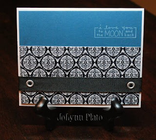
I have resisted collage, mainly because when I try to throw things together and make them look like one piece, my finished pieces tend to look too intentional... not haphazard enough. I looked at the SCS Challenge this morning and really let it brew all day before I knew what my inspiration would be.
Back when I first saw the movie, Mr. Holland's Opus, I was touched by its portrayal of Mr. Holland's acceptance of his son's hearing impairment. When he sang the song, Beautiful Boy, by John Lennon, to his son, I remember tears just falling down my face. What a gorgeous song to write for your child.

So, today's card blends that song with a favorite picture of Max and me. I will probably end up using this for a scrapbook page hidden journal. We waited so long for Max and almost gave up on him coming in to our lives. I can bond with Mr. Holland and his road to acceptance of what his son's "normal" would be.

If I could alter any part of the card, it would be to make our photo a bit more transparent. But, for a gal who's wary of collage, I think I done good. :) I think I will even duplicate the idea for Ignatius and for Scott. Hmmm, which songs suit them...?

Card size: 4-1/4 x 4-7/8"
Cardstock: SU! To the Nines DSP; SU! Bashful Blue
Stamps: SU! Always
Ink: Color Box Chestnus Roan (for edge distressing); Tim Holz Distress Ink Vintage Photo
Alphabet: Spare Parts Alpha Chips
Ribbon: SU! Chocolate Chip twill, Kraft taffeta, and Bashful Blue taffeta
Sheet Music: Music Notes.com

Friday, June 26, 2009

Triple Play Revisted

Before I get into the cardmaking of this post, I had to share a photo of my morning craft partner. Max was very interested in stamping this morning. He used multiple ink colors, and grew appreciative of why Mommy insisted in cleaning the stamps between colors. He even wanted to try his hand with the scalloped oval punch. {Tear...sniff...tear}

Now, for today's card. It's been a long time since I combined SCS challenges, and today felt like that day. So, here's what inspired this card:
SCS Sketch Challenge 234 (shown): I think my rectangle panels were a little large, but I went with it anyway.

SCS Ways to Use It Challenge 224: Use bold and bright color elements. Whenever I break out red cardstock and patterned paper, there's no way around this.

SCS Limited Supply Challenge 226: This read like a menu from a Chinese restaurant. We had three areas from which to choose one part. I chose:

Menu #1: Neutral images (a medallion that hinges on floral, but I think it stays true to the spirit of the challenge.
Menu #2: Reds/Blues. This was definitely challenging for me, as I have plenty of blue expertise, but I use red sparingly.
Menu #3: Well, I guess it says ribbon and brads, but I really didn't want to dink with ribbon... I had a hard enough time deciding on brad placement.

Card Size: 4.25 x 5.5"
Cardstock: SU! Bordering Blue and Real Red; white
Patterned paper: SU! Ski Slope (Winter Mini)
Brads: Spare Parts
Stamps: SU! Baroque Motifs and Great Friend
Inks: SU! Bordering Blue and Real Red markers


Tuesday, June 23, 2009

CC224: Friend Tree


Today's SCS Color Challenge was to use Pacific Point, Tangerine Tango, and Summer Sun. It took me quite a lot of time, not to mention paper, to come up with a final outcome. However, I kind of like it.
The card measures 4.25 x 5.5"and is mounted on white cardstock. After the base, there is a layer of Pacific Point, and then a layer of SU! Jersey Shore DSP. I used SU! Brilliant Blue for the sentiment, from SU!'s Great Friend set. I stamped it and then punched it out with the Curly Label punch. The layers behind it were cut freehand. The inner panel is a layer of Pacific Point, a layer of white, and a layer of Jersey Shore. The ribbon goes under the inner panel. There is also a strip between the white and the sentiment.
The tree was an afterthought. I actually created a separate card, with the tree to the left and a whole lotta white space to the right. It felt really off balance, but I had worked hard on that tree. So, I cut it out and made it the focal piece of a new card. The tree is from SU!'s Season of Friendship set. I stamped the tree in Chocolate Chip and the leaves in Summer Sun. I paper pieced some of the leaves for more dimension.

Monday, June 22, 2009

Jessica Sprague

Just a shout out moment to Jessica Sprague. She is offering a free workshop on photo editing. It will cover frames, masks, and special effects.

Did I mention it was free? So yes, I am taking it. I can't wait to learn more.

Clean and Simple Thanks

Today's Clean and Simple challenge was paper piecing. My middle name, yes?

I paper pieced the wrench from SU!s Totally Tool. I stamped the wrench onto metallic silver paper using StazOn, then I cut it out and adhered it to a 3.5 x 3.5" card base of SU! Not Quite Navy textured paper. I used some Walk in the Park DSP scraps I had from recent cards that I used for one of my layers. The other layer unites the metallic feel of the wrench via jumbo silver eyelets. I thought some twine would make a pretty cool look to this very manly card. I also rounded the corners with my corner rounder.

Sunday, June 21, 2009

Features Stamper 124: Christy S

Now that summer has officially begun, I am trying to do at least one card challenge each day. We'll see how that goes, but it does feel good to be in full swing with that again.
As we look down the barrel of another Monday, I thought I would make a card that gives me a laid back feeling, if possible. This next week is not very busy at all, which is... fantabulous!

Christy S is this week's featured stamper. Her card, Living Large (shown), is one I chose to CASE. I loved the layout and the clean and simple style of this card.
I chose to change her card in several ways. I decided to use patterned paper rather than solids, with the hope that it wouldn't draw too much from the layout. I have a solid kraft base, layered next by SU! Bella Birds DSP. On top of that is a layer of SU! Not Quite Navy, and then another pieced layer of the Bella Birds, the flipside of layer 1. My spabella stamp is in the oval, which is backed by more Not Quite Navy. My oval is a lot more predominant than Christy's, mainly due to the image, but possibly because my card itself is a little smaller than the typical 4.25 x 5.5".
To make the sentiment pop a bit, I popped it up on dimensionals and to tie in layer 1, I put more of it behind the sentiment. Also, I paper pieced her robe to match the DSP.
Fun! I just want to carry it with me all the time. Maybe I shall!

Friday, June 19, 2009

Once Upon a Shoe Bugaloo


Saturday's inspiration challenge from SCS asks us to look at the Bugaloo website. I chose these shoes for my inspiration.

At first, I was looking for what would help me use my stash left over from the invitations I just finished. The color scheme for these shoes helped with that. I love that we are dealing with leather, and texture, and stitching, so I tried to incorporate the feel of each.

For this 4.25 x 5.5" card on SU! Chocolate Chip cardstock, I used some of SU's Walk in the Park Designer Series Paper from its Occasions mini-catalog as my first layer. I liked how, in the inspiration piece, the leaves were cut out to show the layer underneath. Knowing my low-level craft knife skills, I chose paper piecing the leaves on the tree and the wing on the bird to match this base, rather than trying to cut out a window for very small parts.

I chose to use Cornish Heritage Farms Pretty Birds from the Kim Hughes Collection. I love the play on words for the sentiments. I chose "Somebirdy Special," deciding to make one of the birds differ from the rest. I tried to give him a shadow, too... I have to work on that a bit more. Looks like he had a little accident. :)

For shading, I used my Copics: Cool Gray, Pale Blue, Burnt Umber, and Atoll. For stamping, I used SU! Chocolate Chip. For faux stitching, I used SU! Close to Cocoa marker. I paper-pieced the limb, the leaves, and the stand-out birdy. For the So Saffron layer, I embossed with Cuttlebug's Stylized Flowers folder.
I think it's pretty cute.

Craftiness on Crack

OK, the first thing you should ask when someone wants you to make wedding invitations for them is, "How many do you need?" I asked this way too far in to the process, and I got the answer of 200.

At first, an air of tedium enveloped me. Despite my OCD nature, assembly-line type activities are not appealing. However, as of late, I have actually enjoyed completing them. It was a brainless quiet time that gave me some satisfaction, albeit delayed.

So, as of today, the 200 invitations with their three layers each, one of which was embossed, their matching response cards, and their stamped envelopes are all finished. They will be delivered on Monday. Here is their story.

The specifications I got from the bride indicated that her colors were watermelon and canary, a la David's Bridal, and that she was going to inject daisies into that mix as well. I knew the watermelon would have the ability to take over the invite if allowed, so I tried to keep it at bay.
I found the watermelon metallic paper at Scrapbook Friend'z, as well as the initial color of textured canary cardstock. Alas, the canary color was in a few different hues, as my order of paper was delayed from Friend'z, and I found myself scrounging colors as similar as possible. It all worked well because the canary was embossed with Cuttlebug's Stylized Flowers embossing folder and was then layered between the watermelon metallic base (5 x 7") and the translucent white vellum top layer (4.75 x 6.75"). On this layer, I sampled (via MS Publisher)the watermelon color from the David's Bridal site and used that as the ink for our script.
The script I used was French Script MT. The type style for the response envelopes and for part of the response cards was Candara is all caps.

I used Jolee's Daisies vellum stickers, and let me tell you, thank God for eBay. They only came six usable daisies to a package, so I had to order a boatload (well, 34 packages) of them. I found them from various eBay vendors for well below retail and reasonable shipping. I originally found them at Meijer, but they were $2.99 retail. I got them from eBay for about a dollar less per package on average.
I have to also give a shout out to LCI Paper, whom I found online. Great envelopes. Great prices, delivered exactly when they said they would be.

The response envelopes were a bit frustrating. I could not program my printer to take them (a little larger than 3 x 5"), so I ended up printing the response address on clear labels. When the labels were on the envelopes, they looked so plain, and, quite frankly, slightly off center (I think I loaded them wrong in the printer). So, out came the stamp!

I started by stamping the small flower from SU!'s Simply Said set in SU's So Saffron. I stamped it twice next to the address, and three times on the back flap of the envelope. Then, it appeared that there was a disconnect with the stamping, so...

Yes, you are correct. I stamped on the other envelopes as well. The inner envelope has three small flowers where the names will be written. The outer envelope has one flower on the flap (it's a V flap) and three in the lower left-hand corner of the envelope.

So, I finish tonight, and I start cleaning up my area, which has been a train wreck for a couple weeks due to this work in progress. What do I find? Another set of response envelopes! Man, when you think you are done, and a pack of 25 envelopes pops up out of nowhere, it can really throw you for a loop!

Now, I really am finished. They need to be stamped, labeled, and sent, and I believe the bride and her party will have the fun with that part.

Total cost: about $425 for materials.