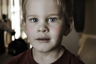
 For this activity, our exercise was to colorize a photo, giving it a vintage feel. The toughest part to this was finding a photo that would really lend itself to the colorizing. This is the third photo I chose and the only one I actually felt turned out a bit on the side of "vintage."
Basically, we learned to manipulate the hue/saturation layers in Photoshop. We created some sharper colors and better contrast with our photos. Then, we created a

I definitely have to play with this more, but it's good to know how to do it. I have always wondered.
Also, as a bonus project, Jessica asked for us to use a frame and a star brush on our colorized photo. Here is my shot at that... using all the elements from the class so far...

No comments:
Post a Comment