Hello sketch enthusiasts!
Over the last several weeks, I have been putting my sketches into a document that I lovingly call Seize the Sketch. I started with my oldest post on Splitcoast Stampers (way back in August of '05) and moved forward. Any card I created without the assistance of another sketch or CASE is included. These are my first 50 sketches.
I encourage others to do this sometime. It's amazing to see the phases you go through as a crafter. You will notice that my sketches started very simply, then became more complex as I participated in more and more challenges.
So here is my challenge to you, blog friends. From now until August 15, choose at least one of the sketches to use to create your own card. Remember that a sketch is just that, a sketch. Minor things can definitely be altered, but the "spirit o' the sketch" must be kept. Here's laywomen's terms... if someone looks at your card and says, "Hmm, how did she use the sketch?", it has been altered too much. Otherwise, get those creative juices flowing.
What would a good challenge be like without blog candy?! Woo hoo! The blog candy for this challenge is the SEI kit shown. It includes: flower chipboard album, eight 12x12 papers, 7 die cut circles, 4 yards of ribbon, puff stickers, beaded stickers, rub-ons, chipboard flowers, and binder ring.
How to play:
1. You may complete as many entries as you want before August 15 at 11:59 PM Central. After that time, I will randomly choose a winner from the entries received.
2. Make a comment to this blog entry. The comment should include: a link to your creation (SCS, your blog, whatever you wish), the number of your comment, the number for the sketch (ex. STS 22), and your first name and e-mail address (the e-mail is only for me to notify you if you win).
3. If you have no way to post your card, you can also send me a picture or scan at jplato@jplato.org, and I can post it to my blog for you, giving you full credit. Please still create a comment so that you can have a chance for the prize.
4. Just for fun, if you are an SCS girl, let's make a gallery. If you post it to SCS, I sure would like a shoutout to this contest. In your keywords, please reference this as STS50 (no spaces).
5. Have fun!
Wednesday, July 30, 2008
Tuesday, July 29, 2008
Summer School Thanks
Thanks to a "Karen Kick Start" with a great Bella card, I created this gift for my son's summer school teacher. I was wandering through Meijer looking at candles and such, when I happened upon the aisle containing these cute picture albums. This one had a window in front, so I immediately thought about personalizing the album (I used Gift Box Chipboard Thickers by American Crafts). I then bought a disposable camera, and, Voila, a gift was born. I think it's pretty creative. Inside the card I wrote that she could use it for some last minute snapshots of the students this week if she wanted.
The Bella card features teachabella. She makes me laugh because she is so... together. She looks like a first year teacher on the first day of school. I have a very funny Bella in mind for the teacher on the last day of school. Hmmm... perhaps I should sketch that out. :) Anyway, here are the specs on this Bella as I can piece them together (I made her at Stamp Camp, so bear with me):
Size: 6.5 x 5 inches
Ink: Adirondak black, Color Box black Cat's Eye
Other stamps: Hannah Stamps (sentiment)
Coloring media: Copics, black colored pencil, Gamasol
Paper: Papertrey white, SU! Basic Black, SU! Prints DSP (Real Red?)
Ribbon: Could be SU!; not sure
Circle cutter: Creative Memories
Scallop punch: SU!
Monday, July 28, 2008
Blintz Base Birthday
For WT173, we were asked to create a card using the Blintz Base technique. I hadn't done it before, and I have to say, I kind of like it. We were given a tutorial (Word document) by SCS's Cook22. I thought the directions were very clear. I followed her measurements to a "T."
At first, I started with some Blue Bayou Prints DSP, however, I noticed that more contrast was needed for this technique. So, of course, what do you reach for when you want the design to pop? Yes, American Crafts. I found one of my favorite prints from them, Sixth Avenue Little Italy. Yes, I still have scraps of that big enough for this technique!
Initially, I had something on the inside square, but I hated how it looked, so I changed it to an embossed square in Basic Black with a sentiment (SU! Fun Filled) in Craft White. The Blintz Base is adhered with Dimensionals on a 4.5 x 4.5 square of Basic Black. The card is mounted on a Certainly Celery base. I used the corner rounder on the base to blend with the design of the paper, which had sharp corners as well as rounded ones.
Sunday, July 27, 2008
For Uncle Jack
My uncle is celebrating his 50th anniversary of his ordination as a priest this August. Impressive, especially since he's been battling cancer as of late. Sadly, I won't be able to attend the celebration, as it is the day before the beginning of school for me. Our district considers it the "day after a vacation," and, basically, doesn't grant anyone a personal day. That means a dock day, which is 1/180th of our salary. That plus the travel would be a big economic burden on us.
Anyway, I made this card to send to him. I was inspired by this week's SCS Featured Stamper, artystamper (aka Julia). Her gallery has a lot of terrific ideas. Very clean. Take time to browse it. I decided to CASE her card, An inch of pitter patter.
I tell you, every time I use the Cuttlebug with my Nestabilities, I have to look up a tutorial. I can never recall how I should emboss. The tutorial I found was interesting, but different from what I had seen before. It worked, and that was the important part.
I had this all on PTI white, but I am continually confounded with embossing on the main piece of cardstock. The back of the card never makes it through unscathed. So, I cut it and matted it on silver metallic paper... and it was huge. I then had to see if I had any white 12 x 12 cardstock that would hold up a card. I found some Bazzill textured.
My other fun experience was with my Xyron. I swear I must have accidentally picked up a lamination refill, although it's worked OK on other things. I could not get it off of the image without separating the paper. It wanted to stick to it all. I finally thought this was not a bad plan, since I have sound the metallic pigment inks to fade over time. So, I just cut around the matting and left it on the top. It really makes for a sturdy card. Hopefully, it will help the silver to stay a bit longer.
Size: 4.25 x 6 inches
Stamps: Papertrey Ink Everyday Blessings
Paper: Papertrey Ink white, silver metallic, and Bazzill white
Ink: Encore Ultimate Metallic Silver
Other: Spellbinders Nestabilities Oval Scallop die with Cuttlebug
Saturday, July 26, 2008
Back in the Saddle
Oh, how I have missed creating! Life took over for a little, but now I think I am back in my rhythm.
I just finished IC138, and I have to say, I think there are forces of evil working against my mojo. It started fairly simple, then my Close to Cocoa ink pad had a technical malfunction. The ink pad popped out. So, after about 10 minutes, and 10 very brown fingers, later, it snapped back in. Then, every decision I made seemed quirky. I ripped and reattached quite a bit on this card.
We were asked to choose a website for inspiration. I chose the website of one of my absolute favorite artists, Becky Higgins. I have never had the privilege of meeting her, but, from reading her articles and seeing her creations, I have become quite a follower. So, of course, I wanted to take a peek at her site for inspiration.
I decided to emulate her color choices as well as some of her design elements. Balancing my card was probably the toughest thing for me, as I wanted to do justice to her site's design. I had the "Thanks" sentiment and the copper-toned jumbo eyelets (a story about those will follow), but I needed that third element to complete my triangulation of focal points. I decided to pop up the block with "totally," as when I speak, that would TOTALLY be the word I emphasized. :) I am just hoping it doesn't overshadow the main sentiment. Hmmmm...
OK, the eyelets. Way back in October, Karen and I went to CKC Kansas City. I was signed up for not one, but two of BH's workshops. I was sooooo excited. However, her daughter came down with croup, and she had to cancel. How scary that must have been for her. Still, she put together some of her "favorite things" to give to those of us who missed her afternoon workshop. One of them was... the copper jumbo eyelets I used here. So, here's to you, Becky. Someday, maybe I will get to meet you in person. Until then, keep on creatin'.
Size: 4.5 x 5 inches
Cardstock: SU! Very Vanilla, Chocolate Chip, and Wild Wasabi
Stamps: SU! Make It Count, Amazing to Zany, Baroque Motifs, and Paisley
Accessories: The Paper Studio Ribbon Scraps, Scrap Arts round copper eyelets, SU! tab punch, corner rounder, Dimensionals
Wednesday, July 23, 2008
More on Little Monkeys
I played around some more with the Little Monkeys storage system that I was awarded. I thought I would show a few more pictures for those wondering what, exactly, this thing is.
The system comes with sleeves, similar to my favorite thing in the world... page protectors. Inside each sleeve is a piece of cardstock; one side clingy, the other not. You place your stamps on the clingy side. I use the sleeve's backside as a pocket. Because I post cards and submit them to different audiences, many times, I need to know some info from them. Throwing away all packaging was out of the question. So, I kept image sheets and titles when I could. You will notice on my photo samples that I have several sets of Verve stamps on one Little Monkey sleeve. I also got my whole set of Cornish Heritage Farms Pretty Birds on one card.
The system comes with some adhesive "cling" that can be cut so that stamps that are not acrylic can be organized in this system as well. For example, the Bellas come needing some cling. I adhered the cling to stamping bella, and she now clings to the insert as well as to an acrylic block.
My previous storage system included page protectors and binders. In the page protectors, I would place the stamps with their packaging. It sounds reasonable, but it really started taking up a great deal of space. Basically, I see myself having maybe two of these boxes. I have exhausted all the sleeves that came with the starter set (6), and will be ordering more.
For now, I am placing them for the most part by manufacturer. In the future, I may organize them more like my stamp drawers, according to theme or image style. However, at this moment, I am liking this product a whole lot!
The Booty Has Arrived
Hello to all! So sorry for my prolonged absence. It has been crazy lately. It just seems like the hours fly by in my day. Happily, I have been diversifying my activities. I have been somewhat crafty helping a friend complete a gorgeous scrapbook to give to her daughter before her wedding. We also made lots of nugget tins and other shower-type goodies. In addition, Scott and I are trying to get ready for a garage sale this weekend. Last, but not least, I have been quite social and have been spending time out with friends at dinner, movies, stamp camp, pools, and hot tubs.
I was so busy yesterday that I didn't open a package that appeared on my doorstep. Silly me! It was my Stamping Royalty Booty! Yeah!
So, I created a little movie for you, my loyal readers. Oh, let's face it, as my hubby was saying, it's for me, too. :) It's 3 MB and it should open for you or start downloading when you click on this link:
Stamping Queen
It cannot go without saying that I am humbled by the generosity of the following companies, and I encourage you to click on over and take a peek at their goodies.
Paper Crafts Magazine
A Muse
Stamping Bella
Fiskars
Gel-a-tins
Clear Snap (makers of Color Box)
see d's
Little Monkeys
AND SPEAKING OF QUEENS...
The gal who started us all on our way to crafting poverty, KAREN, is now officially published. YEAH KK! Use your Hobby Lobby or Michaels Coupon for this week, get to one of those stores, and buy the August issue of Cards magazine. Flip to p. 84 and 85, and there's her spread for a baby shower... using American Crafts paper, of course! Gorgeous! Is she telling us something about Kim?
Thursday, July 17, 2008
Vaca Scrapping
I cannot believe I got this page done. I just kept the materials on my work table, refusing to put them away until they were in a book. Woo hoo! I guess that worked. It was annoying, but it worked.
Much of the materials for this were either purchased prior to or during our trip. The background is either Bazzill or Stampin' Up!, something I had in stock. The patterned papers were from Making Memories. I have been waiting to use some of these shapes, and when I saw the interstate sign, I knew it would be perfect. I bought the self-adhesive chipboard accents at Michaels while we were in Reading. I was drawn to the one that said, "Swimming at the hotel pool," as that is always a favorite of my sons. I also liked the bracketed "family vacation" title. I have to laugh because, as I was showing this to my husband, I realized that i placed the frame on the picture in the bottom left upside down. How very fitting that is when driving 1700 miles with a 3 and an 11 year old! I kept it that way... I'll just tell people it was planned. Oops, I guess that won't work now, eh?
In all, I love how it came out. There was an adequate amount of photos to sum up the week. I wish I would have had more pictures at my niece's house... I even had my Nikon with me. I must have been too enamored with her cute house to realize I should take pics.
Monday, July 14, 2008
Thoreau Birthday
This vase so completely fits for a birthday card for my friend, Jules. I just love this set, too.
For today's SCS Technique Challenge, we were asked to use the grid technique. Since I had done so on a few occasions, I wasn't as worried about the technique as I was the layout.
I used all scraps except for the card base. At first that was a scrap of white, but white was too harsh, so I changed it to vanilla. I was surprised that I didn't have a card-size scrap of vanilla, but now I know.
I left what seem to be some wide-open spaces, but I liked the card balance and didn't want to go berserk with embellishments.
Size: 4 x 5.5 inches
Stamps: SU! Best Kind of Friend and Paisley background
Paper: SU! Very Vanilla, Old Olive, Chocolate Chip, and Creamy Caramel
Ink: SU! Chocolate Chip, Old Olive, and Creamy Caramel
Brads: Spare Parts
Ribbon: SU! Creamy Caramel taffeta
Sunday, July 13, 2008
Pullin' For You
I'm not a huge "bunny" person by any means. But when I saw the "I'm Pullin' for You" set from My Favorite Things being used on cards, I was hooked to this particular set. I think it was the play on words/images. Here's a card created by Toy that previewed the set. Now that I look at mine, it is rather similar to hers. She did a bit more with coloring.
Today, I CASEd the SCS Featured Stamper, Stephanie.Hargis. I used the basic sketch of her card, Masculine Birthday Whimsy.
I also used my Copic Sketch markers for the first time. Woo hoo! All but the orange is Copic, as I did not have an orange hue yet... YET.
I tried to stay committed to using scraps. All are scraps except the white. I didn't have a decent white scrap for this one. The patterned paper is actually Martha Stewart wrapping paper. I wrapped a gift with it, and I thought the scraps would be great for cards. She partnered with EK Success, and I bought this on clearance at Michaels. Originally... way too expensive.
Size: 4.25 x 5.5 inches
Paper: SU! Barely Banana and Basic Gray, Papertrey white, Martha Stewart wrapping paper
Stamps: MFT I'm Pulling for You
Ink: Tim Holz Black Distress Ink, Copic Sketch markers in Lime Green, Willow, and Pale Blue, SU! Only Orange marker
Accessories: Brown grosgrain (JoAnn's), Cloud 9 Rain Dots
Saturday, July 12, 2008
Odd Little Cake
Holy cow. This card for IC136 took way too long to make. First, I started out wanting to use the Champagne cake as my inspiration. Well, that just would not do what I wanted it to do for a wedding card. Then, I decide I shall go with something far more basic. So I choose the Paisley cake. At first I was just doing the bottom panel with flowers as a border. It looked like part of a cake when I thought I was finished. So, I thought... make it a cake. And voila... hours later, let them eat cake! :) Still looks fairly simple, though. That'll be our little secret.
I have to say... it is amazing the cakes that are on the website from which we were to be inspired. Absolute works of art.
Size: about 4.25 x 5.5 inches
Paper: Bazzill gray, Papertrey white
Stamps: None... it's all me
Accessories: American Crafts Ultimate Gel Pen, SU! Pretties set, Cuttlebug Swirls folder
Friday, July 11, 2008
Copics
I have hemmed. I have hawed. I have gone as far as having them in my shopping cart at some sites. I have lived vicariously through Karen's wonderful set. Now, I have finally dipped my toes in the water.
Yes, the Copic Sketch markers have begun to find my home. Karen introduced me to the fact that Hobby Lobby sells them. So, I decided to put my 40% coupon to that use. So far, I have 0 - Colorless Blender and 100 - Black. I also purchased (40% off) their DVD entitled Techniques & Projects with Sketch Markers. Between that and Karen going through her certification, I think the investment will finally be worth it. I am hoping the DVD will also help me with color selection, since I have chosen to buy them individually.
Retail at Hobby Lobby, they cost $5.99, which is about right. With the 40% off coupon, they come to $3.59 'round these parts.
Why the expense for markers? Well, I could go on and on about them, but not everyone really cares, so I will simply give you their link and let you learn, if interested. Of course, I will use them quite a bit once I have a decent stash. www.copicmarker.com
Also, for those who do not know, on Monday, QVC is having its Summer Scrap-a-thon. Don't know if there will be real deals or if we're being reeled in, but I thought I would pass it on.
Coming Soon - Seize the Sketch!
I decided that I would compile my sketches from cards I have done. I will call this Seize the Sketch. I thought it might be helpful to others when looking for a design--- maybe easier than looking over this whole blog or my Splitcoast gallery. Stay tuned! I will have blog candy and everything when this debuts!
Colors and Limits
Today, I was trying to kill to challenges with one stone, and I came out with two cards! Bonus!
One card I think I will make part of a scrapbook page, as it is more of a card to me. It was for LSC176, the limited supply challenge. I thought I would also try to use the colors from the Meet the Verve Divas Challenge. I tell you, my crafting area is a major disaster due to the indecision I faced in my cardmaking today! In the Limited Supply challenge, we were asked to keep to these parameters:
2. Limited embellishments
3. No patterned paper
I think I did OK with those, if the flowers do not count as an additional layer. Anyway, here's why I am keeping it for me.
It was a rough school year, stress-wise. I had a lot of pressures weighing me down, and summer was the light at the end of my tunnel. Now that it's here, I don't want to waste a single moment. June was crazy busy, and now July has slowed (yah!). So, a scrapbook page to remind me of what's important sounds like a plan. More to come with that, obviously.
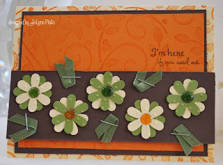
I realized after making this card that I didn't use any Verve stamps. Since this was for a challenge on the company's forum, I thought making a card with at least one of their stamps may be in order. So, my second card, which is similar to my first, uses Verve's Here for You set. I love the fonts and the sentiments in this set.
I really like both cards. They have subtle differences, but are enjoyable in their own ways.
Recipe for the Summer card:
Size: 4.25 x 5.5 inches
Paper: SU! Pumpkin Pie, Chocolate Chip, So Saffron, and Old Olive
Stamps: Hero Arts Fine Line Letters, SU! Make It Count, SU! Office Accoutrements, SU! Leaves and Swirls Stampin' Around
Ink: SU! Pumpkin Pie, Chocolate Chip, and Old Olive
Punch: SU! Daisy
Accessories: Offray ribbon, staples, pop dots, Cloud 9 Rain Drops
Recipe for I'm Here card:
Size: 4.25 x 5.5 inches
Paper: SU! Pumpkin Pie, Chocolate Chip, So Saffron, and Old Olive
Stamps: SU! Leaves and Swirls Stampin' Around, Verve Stamps Here for You
Ink: SU! Pumpkin Pie and Chocolate Chip
Punch: SU! Daisy
Accessories: Offray ribbon, staples, pop dots, Cloud 9 Rain Drops
Paper: SU! Pumpkin Pie, Chocolate Chip, So Saffron, and Old Olive
Stamps: SU! Leaves and Swirls Stampin' Around, Verve Stamps Here for You
Ink: SU! Pumpkin Pie and Chocolate Chip
Punch: SU! Daisy
Accessories: Offray ribbon, staples, pop dots, Cloud 9 Rain Drops
Thursday, July 10, 2008
Ployshrink Anniversary
Today's Ways to Use It challenge, Mini Madness, asked us to use small things. I immediately thought of polyshrink. I just HAD to have some a few years ago... only to wait a few years to open the package. I must say I love it. It's the whole shrinky dink thing coming back to me, except my heat tool gives me much faster gratification than an oven. {That sounded sick and wrong to the dirty-minded, I guess. Or maybe to just me?}
So, I needed another anniversary card. I knew I wanted to use the polyshrink I had, but which stamp and what ink? I started with Royal Purple Staz-On, but when it shrank, it looked black. I then went to copper pigment ink, but, you know, it did not dry when it shrank. It looked cool... very... but stayed liquidy. If I had waited for it to dry, maybe it would be different. I have a wedding card to make, perhaps I will give silver a shot and use some patience.
I ended up using Azure Staz-On. Again, it looked pretty dark, but, with the white backgrounds and Not Quite Navy ink and paper, it looks great.
The image stamps are from the SU! Always set. The sentiment is from Verve's Anniversary Birds set. Inside, I stamped, "Once in a while, right in the middle of an ordinary life, love gives us a fairytale," from SU!'s Full of Life set.
The background is a Cuttlebug embossing folder. The heart is popped up. The card is 4.25 x 5.5 inches. I used Papertrey white cardstock, which I love.
Wednesday, July 9, 2008
Verve Anniversary
Yet another anniversary! Summers in our family are filled with them. This one is for my brother and sister-in-law, who are celebrating 30 years of marriage. Yes, you may remember a previous card for another brother and sister-in-law celebrating 30 years of marriage at the beginning of July. It's true, they married within a month of each other. Talk about a busy summer of 1978!
I used Sketch Challenge 184 from SCS to design this card. The dimensions are a little challenging, but it seemed to work best with these:
Main white square: 2 3/8 x 2 3/8 inches
Silver mat for main white square: 2 1/2 x 2 1/2 inches
Three smaller squares: 1 inch square
Mats: I used my paper trimmer, but my best guess is that they are 1 1/8 x 1 1/8 inches. My next square punch was too large to mat them (1 1/2, I think).
Card base: Bazzill bling (yeah, baby) cut to be 4 1/4 x 6 inches (start at 4 1/4 x 12 and fold at 6). The typical card size was just a bit too small.
Now, let me chat a minute about my new Verve stamps. Are they not adorable? This is from their set called Anniversary Birds. I bought the set because this summer I realized I did not own one stamp hat wished someone a happy anniversary. Crazy.
The picture at the top is also from that set. It is the sentiment on the inside of the card. I stamped it originally for the outside, but there was just no rooom.
I also used some bling (The Paper Studio Gemstones). The Bazzill bling just deserved to be dressed up. I topped it of with a sheer white ribbon tied with my Bow-Easy. In all, this is one stinkin' cute card. I'm so humble.
Tuesday, July 8, 2008
The Kind of Friend
Wouldn't this card be awesome to get? The sentiment says, "You're the kind of friend everyone wishes they had." What a compliment! Unless, I guess, you're pure evil and people covet that kind of friend. Wooops! There's my "cup is half empty" part of my brain again. {Use the force... feel the force... turn away from the dark side, Luke.}
This card serves three purposes. One is Kazan's Sketch 4 (posted here). The other is the technique I used for yesterday's card: a suspension card. The third is CC174 which uses Groovy Guava, Chocolate Chip, and Barely Banana. I had fun with the card, although I will say I was muttering not-so-nice things as I went. The circle at the top caused most of my agony. I had to use my Coluzzle. The closest circle I could get was a little big. I decided to still use the punches for the DSP and the medallion. Let's just say, I will need to cover the back of this card, too. But doesn't the front look great?
Although I absolutely LOVE Barely Banana, it was a tough one to blend in with the other two. I used it in the sentiment medallion and a swatch of grosgrain ribbon (just about all I had left of that color... alert!). I used SU! Afternoon Tea DSP (of course... c'mon... Chocolate Chip and Groovy Guava scream for that paper). I also decided to use punched flowers for my accents. The flower in the center of the bottom row is on a dimensional and has a brad center, whereas the other four are secured with mini Glue Dots and are simply curled slightly up. This was a tough card to photograph all that was going on in it.
I thought about an additional sentiment strip, as it appears in the sketch, but I decided on knotted ribbon instead. The close-up shows the back of the medallion.
What's funny is that I e-mailed Karen saying I could not remember why I ordered Best Kind of Friend. I didn't recall what drew me to it. What a nutcase I am.
Size: 5 1/2 x 4 1/8 inches
Stamps: SU! Best Kind of Friend
Punches used: 1 1/4 circle punch, 1 3/8 circle punch, Coluzzle circle template, Daisy punch
Paper: SU! Afternoon Tea, Chocolate Chip, Groovy Guava
Ribbons: from my scraps
Brads: Spare Parts
Also used: Dental floss, tacky tape, Dimensionals
Monday, July 7, 2008
Suspension Card
Oooh, easy and fun. I like those two things together. Today's technique to try, a suspension card, was cool. Imagine that, "suspension" and "cool" in the same sentence.
I needed a card for a colleague whose wife had a baby recently, so I decided this design would fit nicely. Beate's tutorial is clearly written, and the materials are more common than one would think.
Size: 4.25 x 5.5 inches
Paper: SU! Brilliant Blue, SU! Creamy Caramel, and SU! Tickles patterned paper
Ink: SU! Creamy Caramel, Close to Cocoa, Going Gray, and Ballet Blue markers; SU! Blue Bayou dye ink
Embellishments: SU! Basic Gray taffeta ribbon, American Crafts blue grosgrain ribbon, Spare Parts gray brad
Punches: 1 1/4 and 1 1/8 circle punches
Also needed: dental floss, strong double-sided tape
Stamps: SU! Riveting and Little Layers Plus
Explosion Card
What a cute card! So many fun things you can do.
Initially, I saw this done by TreasureOiler on SCS. She referred to a video tutorial by Dawn, from whom she got the idea. Don't want to take credit for what's not mine!
I made this for a shoebox swap coming up tomorrow. I also typed up this recipe (.pdf file), for those interested. Enjoy!
Initially, I saw this done by TreasureOiler on SCS. She referred to a video tutorial by Dawn, from whom she got the idea. Don't want to take credit for what's not mine!
I made this for a shoebox swap coming up tomorrow. I also typed up this recipe (.pdf file), for those interested. Enjoy!
Sunday, July 6, 2008
Enjoy Every Moment
This week's Featured Stamper, {Teneale}, is definitely a favorite of mine. Way back in January, when I got serious about needing a diversion from what was happening in my life, I happened upon a late-night posting of hers. Immediately, I CASEd her for a sympathy card I needed. Now, I get to CASE her again! I'm pretty happy with that. She's great.
I chose to CASE her Baroque Butterflys, which is such a nice use of neutrals. I was drawn to the Sahara Sand, one of my favorite colors.
My 4.25 x 5.5 inch card, Enjoy Every Moment - Anniversary Edition, keeps the primary use of Sahara Sand, but throws in some brown distressed patterned paper (Basic Grey Archaic) as well as some Blue Bayou. In place of the ribbon, I chose to use half-pearls from my Pretties set. I will say that they were too small for my smallest Glue Dots, so I had to use some Tacky Glue. I think they look great. I kept the theme of the card a happy one, and still used Baroque Motifs and a butterfly.
I used Versa Mark on the background, resembling {Teneale}'s card. I gave my large, horizontal panel more layers, but kept the white-embossed Baroque Motifs pattern. At thins point I used a mixture of stamps. Enjoy (stamped in Sahara Sand)and every moment (stamped in Buckaroo Blue) are, oddly enough, from SU!'s Enjoy Every Moment set. The blue heart (stamped in Buckaroo Blue) is from SU!'s Little Pieces. The butterfly (embossed on Sahara Sand and raised on Dimensionals) is from SU!'s Garden Whimsy. I am not a butterfly gal, but that Garden Whimsy set has been a popular one with me this weekend (see the Inspiration card I made this week).
The inside (also shown) uses American Crafts Mini Marks, Elegant Book Two. At the moment, I have no stamp that says "Happy Anniversary," so this set of rub-ons has been used twice for that purpose. I think one of the sets I ordered this week has that sentiment. I cut part of a longer rub-on to make the two side pieces for the sentiment.
Saturday, July 5, 2008
The Time to Be Happy
When I saw this sentiment, I knew I had to have the Garden Whimsy set. It speaks volumes without saying much at all. It is imperative, and 100% true.
This card fulfills SCS Inspiration Challenge 135. We were asked to be inspired by Mackintosh Enamels. I looked simply at the patterns, and I kept coming up with the same technique... bleaching. So, I went to work.
I decided to try bleaching on some patterned paper (Basic Grey Archaic), but it did not work. I still ended up using the sheet as my mat. I stamped on a piece of Wild Wasabi, using bleach as my ink. I used the butterfly from SU!'s Garden Whimsy, then used the flowers from SU!'s Best Kind of Friend. I will be honest and say that I needed the Stamp-a-Majig for the sentiment, as I wanted it to resemble the butterfly's path. I used Basic Black ink at first on a sample... too harsh! Then I used Garden Green. Perfect, I think.
The design was begging for a third part to complete its balance (I had the butterfly and the flowers). So, after fidgeting with some ribbon that just would not stop taking over as the focal point, I used three green Cloud Nine Dew Drops. There you have it. Fairly simple and most definitely inspired.
Size: 4.25 x 5.5 inches
Ink: Bleach and SU! Garden Green
Stamps: SU! Garden Whimsy and SU! best Kind of Friend
Embellishments: Cloud Nine Dew Drops
Paper: Basic Grey Archaic, Papertrey white, and SU! Wild Wasabi
When Organization Goes Overboard
For about a year now, I have been working on perfecting the organization in my craft room. It is humbling, after reading books and looking at magazines, to see how gorgeous the rooms of some crafters are. However, I am over myself.
I have a room in my house, which is something I didn't have for a long time, and something that others do not have room to do. Also, I have many, many things that allow me to stay organized if I am willing to make the effort. {If you didn't have a chance to see my craft room post, click here.}
But tonight, I almost cried. Instead, I laughed, thank God. I was attempting to organize my ribbon drawer. It contained all those pieces of ribbon that were too large to throw away, yet too small to be on a spool. I realized that it was great to keep these scraps, but if I really didn't want to rummage through and find anything, it was a waste.
For right now, it looks great. It is much better than before. I took inventory of what was on a spool but almost at its end, and I wrapped those on floss bobbins. The metal rings ended up in the drawer with the scraps, but they are, at least, something I can (and probably will) pick up at one time and look through.
On a walk through Michaels the other day, I found these lovely DMC floss bobbins. They have a hole punched in them and come with a 2.5" metal ring. I fell in love and bought 3 (they were also cheap... even better!). It is on these bobbins that I began to put my scraps. While going through my scrap drawer, I round a spool of green grosgrain, which was great as I had just run out of that on the previous spool.
The previous spool was in a lovely plastic, transluscent ribbon box I purchased from Oriental Trading. The empty spool was, of course, in the middle of the row. The photo shows what happened when I tried to get the empty spool out. They just kept unrolling and unrolling. It was nuts.
So, I decided that these ribbon boxes needed a little help from me, the McGyver of crafting (now I am getting full of myself). I took double- sided tape and slid a row of it onto the outsides of the box. My intention was to have it hold the ends of the ribbons that came out of the box.
For right now, it looks great. It is much better than before. I took inventory of what was on a spool but almost at its end, and I wrapped those on floss bobbins. The metal rings ended up in the drawer with the scraps, but they are, at least, something I can (and probably will) pick up at one time and look through.
Off to do some laundry. Then, I shall come back to finally work on the Saturday inspiration card. Wish me luck!
Thursday, July 3, 2008
Belated... yet again
Well, here we have another birthday on the second of the month. And again, I am cursed by the turning of the calendar. Sadly, one of my sons was born on the third of March, so I hope I am better with him than I have been with other relatives.
This card is for my nephew. I needed to keep it a bit manly.
This was a fun and easy card, and I like the results. It fulfills today's SCS challenge: She Scores! This challenge asked us to use scoring in our card. No one has to ask me twice to use my Scor-Pal. What follows is my process.
I had some Cranberry Crisp cardstock laying around from the color challenge, cut for a 4.25 x 5.5 inch card. I also had some SEI linen paper that I had cut up for the color challenge, but ended up not using. I thought, "Hmm... will linen paper score well?" Answer: If you want an extremely subtle texture-atop-texture feel, it was fine... like buttah.
From there, I used my Cuttlebug for the vanilla paper embossing. Putting these two together looked great, especially on a dark base.
I just got the SU! Enjoy Every Moment set, and I was itching to use it. Since my circle sentiments were not quite right for the card, I ended up using the center of SU!'s Riveting (Enjoy Your Day), very carefully coloring in Close to Cocoa, as there was another circle that would have been a wee too big. Thank goodness for the Stamp-a-majig. To add some balance, I added the half ellipse and a square copper brad at the top. I decided this was enough... I didn't want to lose the textures beneath a lot of "stuff."
Now I am off to make some goodies for a friend. She is hosting a bridal shower for her daughter, and I am all over the crafty part of it. Big shocker, right?
Wednesday, July 2, 2008
Challenge after challenge
For today's sketch challenge, I used a few techniques. First, I used this week's technique challenge, chalk pouncing, for the flowers and the stems. I also used an older technique called a Joy Fold card. Thus starts my "Ode to Technique Tuesdays." {prose, not verse}
What does this have to do with the Joy Fold card, you ask? Well, that was one of the Technique Tuesday techniques. I still had the sample, but had little idea of what the card was called. Then, suddenly, I found my ring of techniques. I was thrilled to find the name and the recipe. So Karen, if you are reading this, I still have mine, and I was very grateful for it tonight. AND I miss Technique Tuesdays!
Karen, my dealer, I mean, supplier, I mean, DEMONSTRATOR, used to host "Technique Tuesdays" (before we knew of the company). These stamp camp Tuesdays involved learning a new technique. I loved them, as I appreciated that she would look this information up, and I never seemed to make the time back then. She gave us each a cute metal ring. Each Technique Tuesday, we would get a new card to put on our ring. Sometimes, we would even glue a sample of what we did to the card. Typically, a photo was on the card.
What does this have to do with the Joy Fold card, you ask? Well, that was one of the Technique Tuesday techniques. I still had the sample, but had little idea of what the card was called. Then, suddenly, I found my ring of techniques. I was thrilled to find the name and the recipe. So Karen, if you are reading this, I still have mine, and I was very grateful for it tonight. AND I miss Technique Tuesdays!
OK, back to today's card. When I saw the sketch, I could not get the Joy Fold card (Beate's tutorial linked) out of my head. I kept arguing with myself that it didn't really fit the sketch. But, now that I can stand back and take a good look, I really think it does (rotate the sketch for a vertical orientation)!
I needed an anniversary card for my brother and sister-in-law's 30th wedding anniversary. I wanted to use Blue Bayou, but wasn't really sure what else I wanted to use. I tinkered with some SEI linen paper, but just couldn't get it rockin' with this card. I finally looked back at the color challenges list and decided upon Wild Wasabi and Barely Banana as the coordinating colors (CC148). I also decided that, since my SIL recently started obsessing with potted plants, I would use my new SU! Best Kind of Friend set. Gotta love that set.
After that, I got pretty crazy with my paper distressor, and I think the rest is obvious (at least from my pics and the tutorial link). Feel free to click on any photo for a larger image.
Size: 5 1/2 x 4 1/4 inches
Paper: SU! Blue Bayou, Barely Banana, and Wild Wasabi
Ink: Versa Mark marker, Stampin' Up pastels in Garden Green and Not Quite Navy, SU! Blue Bayou
Stamps: SU! Best Kind of Friend and Blooming with Happiness
Sheer white ribbon, cotton balls
Tuesday, July 1, 2008
'Wat' up, Homie?
That has been a catch phrase of mine for the longest time. Probably since the "Homie don't play dat," days of In Living Color (you can probably guess my age now, right?)
So, when I saw these stamps from Memory Box at Scrapbook Friend'z yesterday, after I laughed out loud, I had to buy them. So, so funny. Memory Box is having a contest for cards using their penguins, too. So, I considered this my "starter card" for the contest. It's also my "starter" Nestabilities card. Yup, I caved in finally and bought a set of oval shapes and a set of oval scallops (ellipses, if you want to be mathematically-correct; ovals if you want people to know what you are talking about).
Today's color challenge (Wild Wasabi, Purely Pomegranate, and Certainly Celery) was my victim. I must say that this turned out so much better than I had anticipated, and I think it is due to the patterned paper (Tuscany by Provo Craft) It gives a richer feel than the colors can naturally give to each other.
I did some paper piecing with his coat and hat, and some paper piercing on the sides of the ovals and at the opposite corners. You may have to click for the larger image to see that. I used a Dew Drop for his magnifying glass... worked perfectly and I didn't have to wait for it to dry like you do with Crystal Effects.
So, in all, I love the layout and most of the colors (I think Certainly Celery was a stretch). I will definitely paper piece my contest card, but I think I will skip the piercing. It was not enough bang for my buck. The Pomegranate was just enough of the red hue for me... deep enough for my typical color scheme. In all, not so shabby. What you think, G?
Size: 4 1/4 x 5 1/2 inches
Paper: Provo Craft Tuscany, SU! Purely Pomegranate, Certainly Celery, and Wild Wasabi, Papertrey white
Stamps: Memory Box Detective Penguin and What's Up Holmes?
Tools: Spellbinders Nestabilities, paper piercing, SU! Dimensionals
Subscribe to:
Posts (Atom)