Monday, January 25, 2010

One World One Heart

Today begins the One World One Heart blogging extravaganza. The theme: Magic Carpet Ride.
Welcome to my blogging visitors! Good to have you here! For the next month or so, I hope you come back to visit, particularly if you enjoy cardmaking and scrapbooking, as those are the two things that I post the most.

When I thought of this theme, two things came to mind. One was the song, "Magic Carpet Ride" by Steppenwolf (1971). Go ahead, click on the link and give a listen! The other thing that came to mind was Disney's Aladdin movie. Wasn't Robin Williams hysterical?!

That brings me to my blog candy. Respond to this post by leaving me your name and blog address (or your e-mail contact, if you prefer). Here are some possibilities for responses:
1. Are you lost in the 60's and 70's? What were some of your favorite songs from that era? Mine: The Beatles all the way. You should see me on the mic on Rock band. Truly in my element.
-or-
2. What's your favorite Disney flick? Why do you like that one? Mine: Bambi. A tale of perseverance through personal loss. And Thumper is adorable.
-or-
3. What brings you to blogging? Me: I love sharing my business with anyone who wants to read it.

Now, for the fun part. On February 15, I will use Random.com to choose the response number that will win my blog candy: The SEI Juliette collection you see here. Click on any image to see it closer.

Feel free to follow my blog (check the area on the right for that) if you like what you see.

Have a great time "blurfing," and I hope to check out your blog (after work today -- bleh) as well!

Saturday, January 23, 2010

Designer Digitals helps Haiti


Click here to see how this kit is raising money for Haiti.

Hip To Be Square

This is my card for the Cards blog challenge. The challenge was to include squares in some way in your card.Size: 4.25 x 5.5"
Paper: Brown cardstock (not sure of the manufacturer), Basic Grey Archaic; cream cardstock
Ink: SU! Close to Cocoa; Copic markers
Stamps: Cornish Heritage Farms Pretty Birdies

A little teaser

One World, One Heart begins this Monday. What is it? Basically a way for bloggers from around the world to meet. For more information, feel free to read the info at the site that coordinates it all.

For those who love blog candy, that's one of the major parts of One World, One Heart. As a participant, I must post my blog candy info starting on Monday, however, I thought my readers would like a weekend sweet treat... so here's a sneak peek... tune in Monday for the whole shebang!

Monday, January 18, 2010

And E-F...

Here's E-F... I had a lot to say with F, so it came close to being chopped.


Now, I must focus on some school-related stuff, so I will be talking a brief break from this album. I also have a crafty open house and stamp-a-stack at Karen's, so I better slow myself down and enjoy!

Moving right along

Here's my C-D spread for MeTAV. Some pretty intense journaling on this one...

Sunday, January 17, 2010

It's about time...

During the summer of 2009, I committed myself to Cathy Zielske's "Me The Abridged Version" class. Since it took place during September, I knew I was not going to realistically get it done then, as that is the worst month a teacher can commit to anything but starting the school year.

Well, all of my Becky Higgins hubub has made me dig back in to what Cathy lovingly penned "MeTAV." I have been doing the journaling as the months have progressed. I am not finished, but I thought I better get some pages published before these things were no longer true about me.

I absolutely LOVE how this first spread turned out. As you can see, the scrapbook is MOSTLY journaling. The spreads will follow the same layout with a few alterations here and there. This means that, now that #1 is down, the rest should be easy peasy. She gave us quite a few .psd templates, but also some Word templates. I used the Word template for the journaling, as Photoshop and I are not always friendly.

Anyway, the layout and ideas are copyright Cathy Zielske and Big Picture Scrapbooking. The words and photos came from my head, clip art, and the Internet. I am using calibri font in MS Word 2007. The brown I am using is R: 66 G: 33 B: 0. I am using Bazzill white cardstock and some American Crafts page protectors. This is an 8.5 x 11" scrapbook with no embellies, which made scanning a breeze. I guess I could add embellishments, but that's not the point. The point is to document information about me in an encyclopedia fashion so my kids have something to hold on to. Well, and you know I'll go back to it and reminisce. Cathy used SEI Dill Blossom patterned paper, and I decided to do so as well, as I have a stack of it, and, quite frankly, it's awesome paper. As I get closer to the end, I will videotape what the whole book looks like. For now, these posts are about the pages... and maybe some inspiration can come to others.

Saturday, January 16, 2010

Karen and JoLynn's Excellent Adventure

Project Life, baby. Karen and I had an afternoon of scrapbooking fun with Becky Higgins' newest product. Look at that craft table! Worker bees!

Today, I focused on my title and end pages and a DPS about carousel rides. The carousel rides did not take place in January, so I decided that my months will be split according to DPS's I do in that month, rather than photos that occur in that month. Less pressure, you know?

Today's DPS was a little challenging in that 1) my photos of Max on a carousel were really blurry, and 2) my photos of both the boys were taken with my iPhone, so the quality was not great. The other thing was that I didn't have the abundance of photos that are typically needed, so I had to decide how much journaling to do vs. how much decorative space to make the page complete.

Enter the journaling cards. The ones that can be folded or left open were ones that I used on both sides. At the end of setting this up, I realized that if you try to put the tabbed journaling card on the left side, you have a bit of a dilemma... the tab shows up on the page before it, but not on the page that it goes with. So, I took out the good ol' Exacto knife and cut through the page protector to solve that problem.

Luckily, I had a date stamp that resembled Becky's that included 2008, as the photos of Ignatius were from December 2008.

One thing I'm finding myself obsessing over seems to be that the decorative cards I use cannot have a totally random nature to them. I must have some unifying themes... color, basic design element, whatever. It's really insane, but I embrace that as my own personal illness with this scrapbook.

Full spread:
Page one:


Page two:

Friday, January 15, 2010

Hurricane Maximilian

Today's installment of Project Life is brought to you by Hurricane Maximilian. There was so much destruction in his path that he gets an entire DPS dedicated to it.

I stayed true to Becky's cards and stickers for this one. Documenting the ravages was more important to me than stressing over the layouts.


Full spread:


Page 1 closer:

Page 2 closer:

Sunday, January 10, 2010

Valentine Challenge

On the Cards blog, the next challenge is one where we are called to be inspired by this card. We could use any part of this card as our springboard. I decided it was a good time to make the hubby a valentine. I used the basic layout: an off-center tag with a sentiment, some white space at the top, a panel edged with a scallop. Because I needed to "man" the card up, I changed quite a few things of the original. I still included hearts because, yes, they are appropriate for my husband. Back in the day, when I was 19 and we were just starting to date, hearts were plentiful on my part.

I changed the color scheme a bit and went with cardstock over patterned paper. I used SU! Creamy Caramel and Ruby Red. The tag was a punchout from an SU! '05-'06 catalog. The tag sheets were based on color family, so this one was from the Earth Elements tag sheet. For the Ruby Red panel, I decided to pull out the Cuttlebug and do some embossing with my Textured Script embossing folder. Then, I used my SU! scallop edge punch for the textured Bazzill brown cardstock strip. I also used my SU! tag punch for the "Be Mine" sentiment, which was stamped with SU! Craft White. For the stitching, I paper punched the holes and then hand stitched some twine I got in an SEI kit. I felt the rough stitching was more "guylike." I used my Corner Chomper to round off my corners (similar to the sample card, but I did all four corners).

Size: 3 3/8 x 5 3/8"
Cardstock: SU! Creamy Caramel and Ruby Red, Bazzill textured brown
Punches: SU! scallop and tag
Ink: SU! Ruby Red
Stamps: SU! Party Punch and Weather or Not
Thread: SEI
Tag: SU! Earth Elements Tag Set

Saturday, January 9, 2010

Cards Blog

...is da bomb. Thanks, Ann, for directing me to it. They have great ideas and challenges. And, oh, yeah, they posted my thank-you card for last week's challenge. :)

Freedom card

I was tinkering with submissions for publications... the hard part with that is that they typically want you to create, say, a July 4 card when there's 7 inches of snow on the ground. You really have to have some serious inspiration (or a stash that works).

I used some of my new purchases and some older scraps for this card. I really like how it turned out... doesn't necessarily need to be July 4 to get this one...

Size: 5 1/2 x 4 1/4"
Cardstock: SU! Kraft, Basic Black, and Real Red
Cardstock "Coupons:" Rusty Pickle
Accessories: adhesive pop-ups; paper distressor; paper puncher; black embroidery floss

Friday, January 8, 2010

Ella-fun-tastic

Oooh, I have a new place that I {heart}. Ella Publishing. You have to register (for free), but I am just scratching the surface of its goodness...Join me...Well, you'll be forced to hear more, I am sure...

Thursday, January 7, 2010

You're a friend

Quite unexpectedly tonight, I made an exciting discovery. The Nestabilities set that I just purchased, Labels Nine, works as a punch for the frame in SU!'s Great Friend set. I was sooooo excited. It's not perfect, but it sure is close enough!

I was feeling some white/navy vibe... call it the snow that surrounds us... and I threw in a little chocolate, as I have been eating quite a bit of that today as well. Heh heh.

Size: 4 1/4 x 5 1/2"
Cardstock: Georgia Pacific white; SU! Night of Navy
Patterned paper: SEI Poppy
Stamps: SU! Great Friend
Inks: SU! Chocolate Chip and Night of Navy
Ribbon: SU! Chocolate Chip Satin (15/16") and Sheer Creations sheer white
Accessories: SU! Dimensionals
; Nestabilities Labels Nine

A Two DPS Kind of Day

Today I worked on two layouts. One was created from photos from today. The other had been in my mind since mid-December and now has been created!

DPS #1: Outtakes of our Christmas card picture photo shoot.


DPS #2: All about our snow day today.


For this one, I used the flipside of yesterday's DPS, where I used SU! Felt Flurries. More bang for the buck... kind of like a see-through fireplace!

Now, off to Pilates!

Wednesday, January 6, 2010

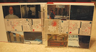
Project Life - DPS 1

Today, I thought it would be fun to shoot pics of the ordinary morning stuff that surrounds me as I transitioned from Winter Break back into teaching. I was pretty tired tonight, but I also wanted to get this idea out of my head, so, here it is... DPS #1 of my Project Life scrapbook.


Most of what I shot was done in my car, which is where I spend a great deal of my time in the AM. There are many cool facets of the Project Life concept. It is set up so that you can do a "photo-a-day" type of project (which is way too much pressure for me), or you can do pretty much anything you please. You can use 4 x 6 photos, or there are nifty cards that can go into the 4 x 6 pockets. The album has divided page protectors, which actually takes a lot of pressure off as far as "layout" goes, although I will say I was a little OCD despite that. If you'll notice, the journaling cards all had to have the same basic pattern... because I am that way...

Here's a closer look at side 1:

The photo of me was taken by Ignatius (and cropped by me, of course). I thought taking a shot of my iPhone tunes would be fun, until I realized how much of my car dust showed up on the pic. I just did a little Photoshopping to it, and it really turned out OK.

Page 2:


Two things I want to point out on p. 2 are shown closer below:

I used SU! Felt Flurries in one of the dividers, as I really wanted a winter tie in. I love how the colors go with the colors of the journaling cards. Additionally, the card entitled "This Boy on This Day" opens up and contains a great deal more journaling. I like that option. Also, you can see how I used the arrows provided with the kit to show which journaling cards relate to certain photos.

Now, I can go to bed. I think, knowing me, I'll get a bit fancier with my spreads. This is a pretty basic DPS, and it was cute and quick. And that, I believe, is the whole point of Project Life.

Tuesday, January 5, 2010

Project Life makes its arrival!

Upon my doorstep
Surrounded by wind chill
Beside the door
Out of the FedEx truck
Into my house
Up to my craft room
Project Life has arrived!


Monday, January 4, 2010

Ah, sweet shopping

I am actually going to try to post a video of my shopping finds. Scary! We shall see how this goes!


Saturday, January 2, 2010

Danke Schön!


With every season comes a time to say, "Thanks!" Here is a prototype of my Christmas "Thank-You" cards. A few variations on the theme: 1. different felt snowflakes in various colors (red was also a contender); 2. different placement for the sentiment (center, left, right). Otherwise, it was pretty much the same recipe:

1. SU! Bordering Blue panel cut to 5-1/4 x 4-1/8" and inked with Bordering Blue
2. SU! Felt Flurries layered and attached with fabric glue to the upper-center portion of the panel
3. Sentiment from SU! Enjoy Every Moment set stamped in SU! Craft White ink
4. White border created with ruler and American Crafts The Ultimate Gel Pen in pastel white
5. Panel attached to 5.5 x 4.25" card

I like it! Now, to actually write them out and mail them!