Tuesday, January 22, 2013

Portrait of the Non-Painter Branching Out

As I play catch up on my One Little Word album from 2012...or, I mean, as I continue my relationship with my word, strength, Ali suggested that we break out some painting and explore collage.  She made a very cool video of herself going through the process which, I must admit, made me less intimidated that when she first suggested the process.  Collage done well kind of escapes me.  I am sooooo linear.  Collage is soooo all over the place.  And Ali Edwards puts it together in a way that looks completely planned.  That is talent.

I am focusing on the color red as much as I can in this album, which again branches out from my "comfort palette."  I decided I would use a taupe color as the base of my "petite canvases."


I started with sponging some red over one of the cards and that became my focal piece for the page.  Then, I looked at stamps and embellishments that would tie in to the theme of "strength."  Here's what I came up with. (pardon the iPhone quick pics)


This canvas incorporates a few collage elements.  Ali used a variety of stamps, an area that I definitely can cover!  One of the things in my life that seems to put a dent in my armor of strength is death.  For whatever reasons, the death of significant people in my life has led to a constant battle with depression for me.  So, I knew one of the canvases had to have that as its theme.  


One of the canvases represents the idea of being strong in the face of public ridicule and judgment.  It focuses on the idea of measuring up, a type of reminder to me that measuring up to everyone's expectations is an unattainable goal. A strong person creates her own unit of measure and stands by that, regardless of the thoughts and opinions of others.  


No page is complete without some mention of seizing the day.  For this canvas, I used rub ons, stickers, stamps, and paint.  Some days, I feel too tired to even seize anything but my pillow.  Seizing the day means overcoming anything that might anchor me in another spot besides where I need to go.


Serenity has always been synonymous with strength to me.  True peace, true calmness, comes with the inner strength to block out the things that keep one from being serene.


Here is the tale of rub ons that made me want to scream.  The saying is perfect.  The rub ons...not so much.  They drove me crazy.  They would not adhere, and when they did, parts of the letters would break off.  Lots of elbow grease to get these on.  The center one from Stampin' Up! went on like buttah.  I think the saying speaks for itself as far as why it got such a prominent place on the page.


Love the symbol of a tree as far as strength is concerned!  Think of all a tree must endure.  Right now, it is in the single digits outside.  During the summer, it can reach up to 100 degrees.  A tree is out there, no matter what, and survives a great deal of changes.  The Bloom Where You're Planted rub on is a reminder that strength comes in accepting what is and making the best of each situation you are given.


I knew I wanted to get embossing in the page somewhere, as I love the texture, and I have several embossing folders that exude strength, like the one that made this pattern.  I see strength in calmness, so this card worked very well on the page.


I had to use a chevron pattern somewhere on the page, as it's a very strong, linear pattern.  I created a canvas about  friends to remind me of the importance of friends in holding me up when I need it.  That also is something that needs to be reciprocated, and I need to offer them strength when they need it.  I talk to my pals on the phone, and text them often, so I added the little red phone.


I believe that each mistake made in life is there to serve as putty to make a person stronger, not weaker.  Allowing myself to make mistakes is something I did not always do, and I still fight with that idea of things being less than perfect.  This canvas reminds me of the strength of continuing on and learning after mistakes.


Here is the final page (sorry for the cruddy lighting).  I think it's cool to look at as a unit to see how the page works and balances in the scrapbook.  Thanks, Ali Edwards, for pushing me a bit outside my comfort zone. I really loved the process of creating this and the thoughtfulness it required.


Friday, January 4, 2013

Scrapbook Surge

For whatever reason, Winter Break seems to bring out in me a "scrapbook surge."  Perhaps it's the extended "time off?"  Perhaps it's the idea of a brand spanking new year?  Who knows?  What I know is that it is better for me than any drug.  I feel like I could work all night on scrapbooking when the surge hits.

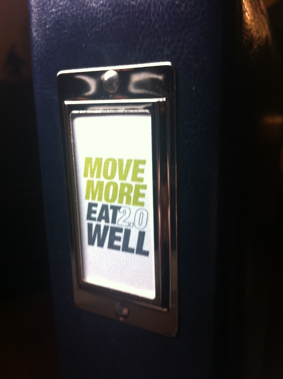
If you are a Carpe Die-hard, you may recall that I started two (allegedly) year-long books that coincided with two Big Picture Scrapbooking classes.  One, Move More Eat Well (MMEW) was guided by the talented Mrs. Cathy Zielske.  The other, One Little Word (OLW) was designed by the fabulous Ali Edwards.  I made it in good faith month after month until about March/April, when I fell off the crafty radar for whatever reason.  I have this weird idea in my head that all is for naught if I fall behind.  Really?  Tonight helped me get over that stupidity.

I blogged last night about my decision to participate in MMEW 2.0.  Then, tonight, I went to town on getting some pages done. And I love them.  

First, I had to fill the gaps from last year that made me feel like I had "failed" in the scrapbook and the goal of staying healthy.  Enter: patterned paper.


That made things feel a little less "undone."  Then, I moved on to the very easy assembly of the new year's pages.  Cathy is not using divided page protectors this year, so it's all 8.5 x 11.  I am doing a hybrid in that parts are printed and pieced together, and parts are printed right on the page.


There were several color schemes to choose from.  I chose lime and gray.  I love that the chevron pattern is this year's choice.  I am quite fond of chevron.  I tried to use my favorite photos of myself from times when I was quite happy.  I also tried to print off pictures of good foods that I enjoy eating, to prove to myself that I actually can eat something besides garbage.  Finally, I changed the spine of the album.


In OLW, I finished up April (with a May photo, but don't tell anyone...).  It included a letter to my future self.


I have a bit more to do from the month of May, but that's for another day.  Whew.  That was a lot, but it felt great!


Sunday, December 2, 2012

Thankful 2012

In 2011, I decided to take all of my "Thirty Days of Thanks" posts on Facebook and make a layout.  Remember?

I participated in this daily reflection in 2012, with my page looking like this:


Just can't stop using that Dill Blossom, I tell ya. 

Here's the Pinterest CASE for this layout.  Ca-yute:


Thursday, November 22, 2012

Page Deux

Cranked out a second page, which was much simpler in style than my Rick Springfield page. I find stickers to be a very helpful way to quickly wrap up a page. For this page, I wanted to capture the idea of motion, as the photos of Max finally taking off on a two-wheeler were full of wonderful blur. Hence the chevron background and word stickers from Simple Stories. I have had the First Bike sticker from Sticko for what seems like forever.

What you probably should realize: this is a "first" that not all parents of children with autism get. In fact, Son #1 took until age 13 to ride a two-wheeler. So Max riding one now is a HUGE deal for us, as it is for any parent, I am sure. We bask in our amazing luck with this one, and his persistence paying off.

Happy Thanksgiving!

As a treat to myself, I am scrapbooking a little today. Here is post #1: The Rick Springfield Concert. This idea has been in my head for a while, and I was still a little fuzzy of what I wanted to do when I started it, however, I really dig how it came out. I wish I had taken that picture of Rick, but my pictures did not take: too far away, using a cell phone, spotlight was not my friend...

I mounted this on BasicGrey Periphery Pinot Noir paper, then layered some sheet music of Rick's (Jessie's Girl, I've Done Everything for You, and Human Touch) and a piece of Tim Holtz Grungeboard angel wing.

Memory preserved!

Sunday, October 28, 2012

Always


This page has been in my head for quite some time, I was just trying to hash out what I wanted to use for it.  There were a few things about my grandmother that were "signature."  I knew I needed pearls, and I knew I needed something resembling the doilies she would crochet.  I found a few other pieces that would complement these things as well.  Here's the recipe:


  • American Crafts textured 12 x 12 paper
  • Maya Road Vintage Trinkets (the pearls)
  • Melissa Frances 1962 Embellishments (the crocheted trim)
  • Prima Vintage Trinkets (the bird medallion...there's meaning in that, but that's a whole 'nother story)
  • Teresa Collins Vintage Finds: Bingo cardstock
  • Studio Calico Fab Rips (chevron flags)
  • Thickers
  • Simple Stories letter stickers and sentiment
I'm quite happy with how this turned out.  Here's the journaling:

Always a stitch.  Literally and figuratively.  This was Nanny, all “dolled” up, horsing around with Pappy.  I loved this picture when I saw it because it was so her.  This song was one that, whenever I hear it, reminds me of her, as she frequently mentioned her fondness toward it.  I am blessed to have memories and a few crocheted doilies to remind me of different parts of her.  But the biggest part of her lives inside me—her humor, her tenacity, her low BS tolerance, her ability to tell it like it is.  Because of all of this, it’s hard to miss her, as she’s still around every day.  And now, she’s up in heaven horsing around with Pappy.  Always.

Friday, July 13, 2012

Shoe Box Swap

Because so many in my crafting circle of friends are involved in education, we have {somewhat} annually had a Shoebox Swap in the summer.  For this, we design a card or two and prep all the materials needed for the persons involved to create two cards.  This year I opted for one design.  In previous years I have done more than one.  I seem to never have sympathy cards when I need them, so I used my new So Sorry set from SU! and some patterned paper from SU! that I had sorted in with my other papers...and could not believe I had forgotten about it!  I LOVE the colors and designs.


This card is a wee smaller than A7: it's 5.25" x 4".  It would still fit fine in a standard invitation envelope.  It is smaller because I uses the Cuttlebug embossing folder and it just did not cover the whole area.  And that drives me nuts.  It is important to note that the So Sorry sentiment comes separately from the other sentiments you can choose for your sorrow.  You want to have slightly different darkness of inks for this to work out without being illegible.  I used SU! River Rock and Sahara Sand.  I started to use Basic Gray, but I could not find my Going Gray pad (I think I gave it away, in truth), so that did not work out.  Plus, the Basic Gray was pretty harsh, and I like how these colors soften the sentiment. I have the main sentiment oval (cut out with Nestabilities) in some SU! version of yellow and inked on the sides with Sahara Sand.  This is raised with Dimensionals.  Then, a snip of ribbon is placed above the next oval of patterned paper.  I am taking all of my sentiments to the swap, as well as several choices for the inside sentiment.  The one I used is a Hero Arts stamp I bought years ago that never gets old with me.

I am really liking this design as well as the colors of this card!