Thursday, January 15, 2009

What a difference eight years makes


I can't get over how much technology has improved in such a short period of time. This layout is of my two boys getting their first haircuts. Ignatius' was in 1998. Max's was in 2006. The photo of Ignatius was taken with a film camera. I got prints, but also got a floppy disk with all the photos on it. I thought I was toooooo cool. And it was in 1998, by golly.
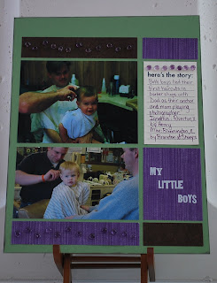
The picture of Max was taken with my Nikon Cool Pix. It is crazy unbelievable how much more pixelated Ignatius' photo is. The file size of his was quite small (22.4 KB), as opposed to the photo of Max (138 KB). Still, Max's photo from two years ago is a lot smaller than what I take with my Nikon D60. I take some whopping huge photos with that, especially if I think I will want larger prints. It's just amazing how much things change.
This layout was for Cathy's Real World Color sketch for week 7. Love the sketch! She referred us to the website kuler.adobe.com, which gives thousands of potential color combinations. She said we could use the one she chose, or we could pick one of our own. I liked what she chose, but I did end up browsing for my own. I picked one called Wedding Colors 3 created by sararachelpaul. Now, those who know me might find it life's little irony that the username for this person includes the names of my two nieces, who are sisters (Sara[h] and Rachel Paul). Crazy.

Anyway, I really wanted to use the purple as my base. Lo, and behold! I had no 8.5 x 11 pieces of that deep purple. Darn. So I chose the green. My paper choices were: Double-Sided Mulberry Chocolate/tan by The Paper Company (brown), Pages in a Snap Purple Stripe (purple), vanilla cardstock, and SU! Wild Wasabi. I wrote and inked in SU! Eggplant Envy. The Baubles are from Stampingbella, and the letters are rub-ons from daisyd's.
Ignatius and Max are so very dissimilar. However, when I look at these photos side by side, I actually do see similarities, especially in the shapes of their faces and that little dimpled chin they get from their dad. The barber shops also seemed to follow a similar color scheme, too. :)

Wednesday, January 14, 2009

Oooh, baby...

...it's COLD outside. When schools close in Central IL, you know it's immediate human popsicle when you walk outdoors. Darn. I will just have to work on some scrapbooking. :)

Tuesday, January 13, 2009

Baptism Layout

It only took three-and-a-half years to make this layout! Actually, it took a couple hours with the right sketch, thanks to Cathy Z.

This is an 8.5 x 11 double-page spread. The design element we are using is emphasis. What is the eye drawn to in this layout? The 4 x 6 photo of Max and the word "baptism." This multi-photo layout is supposed to be fairly simple, with very little journaling needed.

In Cathy's sample, she had colored cardstock behind the smaller photos. With my photos having so many backgrounds and colors, I just could not pick a color that would leave Max as the emphasis and allow others in the photos to be seen without fighting with the paper. So, I decided to resort to some matting, which Cathy Z. does not do a whole lot. The matting under Max is Chocolate Chip, the same color as the background. That's where I started the matting because the light blue paper (My Mind's Eye Bohemia Backyard "Memories" Datmask/Teal) was blanching him out. He is already a very fair-skinned child wearing a cream baptismal outfit. I needed more oomph.

I matted the smaller photos with the teal that is on the main panel (had just enough... whew!). To give it some unity, I decided to use my Scor-Pal and score some lines, pulling the smaller pictures even closer together. I used Thickers brown felt alphabet stickers and my own handwriting on the rest.

Last week, our Church celebrated the Baptism of the Lord. Father Jerry's homily mentioned what we, as parents, say in the rite of Baptism. One thing that struck me was when he mentioned that we ask for Baptism for our child. In asking for that, we are undertaking the responsibility of raising him in the Catholic faith. If we think too hard about that, the responsibility is a bit overwhelming, particularly since Max is attending public school due to his IEP. It seemed somewhat easier with Ignatius attending Catholic school. We knew what he was getting day in and day out as far as his religious upbringing was concerned. Max will take more effort from us... which might be yet another one of God's lessons while raising our boys. It will not be easy.

Anna turned to Mary when Mary presented Jesus at the temple, and Anna told her she would endure tremendous pain as Jesus' Mother. I think that is a lesson for us, too. Even Mary wasn't guaranteed an easy go of it, and she was the Mother of God. In comparison to what she had to watch her Son endure, I think I have it quite a bit better. Tonight's life lesson. :)

Sunday, January 11, 2009

Suddenly...


...last summer...

Ah, what a great song by The Motels. When I was printing these pictures, I was trying to think of a great title for the page, and I kept thinking, "...one summer never ends, one summer never begins..." And thus, a page was born.
For some reason this scanned a little lopsided, so bear with me. Either that or it IS a little lopsided, but in doesn't look as much so IRL. I bought this paper (Sassafras Lass Whale of a Tale) on sale long ago with every intention of doing a swimming page with it. In Microsoft Publisher 2007, there is an option when you change your font color to pick your font, so I chose the blue of the water behind Ignatius' goggles for the font. I chose SU! Brilliant Blue cardstock for accenting as well as for the doodled frames around my photos.
The pictures are from different summers. Ignatius is in a pool in our backyard in 2006. It was never resurrected due to the murderous act it did on our lawn. The photo of Max is from summer 2008. He was going down the airplane slide at Anderson. He loves the slides and the water, that's for sure. Made me remember that the weather in January does not stay around for good.
The theme for this sketch was emphasis. The larger photo was to work as the focal point for the page, with the title bringing the reader's eye to that photo as well.

Saturday, January 10, 2009

Real World Color #4 - Warm Color Semi-Wheel

So far so good. Got one page done tonight. Lots of stops and starts.

This page was inspired by Cathy Zielske's fourth Real World Color sketch. Her idea with the colors is that they come from the same half of the color wheel. She was looking toward earthy tones she had noticed on a restaurant in St. Paul, MN.
My idea began with a sticker I bought on a sheet from The Paper Element. It was a great big cardstock sticker that was waiting for just the right page. I thought I had plenty of pictures and thoughts to go along with this theme.
I chose from my patterned papers after that. I used a variety of companies to get the feel of the colors Cathy had chosen. Since I love these color choices, and since I own a scrapbook-store's worth of paper in these hues, my choices were almost endless. I chose: Creative Imaginations Sonnets Paisley, Cosmo Cricket Jack Sprat (red), The Paper Studio A-Z Textured Brown, and vanilla cardstock. Embellishment-wise, I used only a few; the sticker mentioned before, some dimensionals to give the title depth, and brads from Spare Parts. My SU! Curly Label punch was used next to the journaling, mainly to add the paisley pattern in a small way in another area. I distressed the red layer of the title, because perfection would have been all wrong on this page.
I made my photos black and white because they had a LOT of colors going on that would have interfered with the other colors contained in the layout. I think there's more impact this way.
I think this nicely demonstrates my life as I know it. It may look like an oxymoron, but I have learned to embrace the chaos. It's what i call my "new normal." :)

Monday, January 5, 2009

Online Garage Sale!!

Karen and I have some of our wares online and ready to roll. If you are interested in some low-price, high-quality craft goods, you will want to check this out. Just click the link on the right side of the page. We're keeping the items in the first 5 folders up until they are gone. I posted a TON of patterned paper, and Karen has some great ink/cardstock packages online. The best part is, you don't have to wake up early Saturday to get the deals!

Saturday, January 3, 2009

Give Triadic a Try

Yes, I am feeling like a scrapbooking queen lately. I am also avoiding some other things I need to do. This feels better at the moment.

What a better page to do on a dreary, gray, cold, January day than a July 4th layout! Woo hoo! This marked the beginning of my "wannabe photog" phase. I was starting to look at photos through the eyes of a scrapbooker.
In our Week 6 assignments, Cathy gave us a set of triadic colors for the Real World Color layout. Since I had already completed a "Halloween" layout for 2008, I challenged myself to think outside of Halloween for these colors. Triadic colors are colors that sit on opposing sides on the color wheel. The picture shown is Cathy's depiction of where the three colors would be on the wheel. You can use all three colors, add a neutral, or drop a color and still be pretty safe in your design.
At first, I tried finding pictures with one or more of these colors. Max's shirt had a little green, and I had yet to scrapbook this photo (one of my favs), so I went with it. I used black as my neutral. Then, surprisingly, I used some patterned paper that I did not necessarily like presented as a 12 x 12 sheet. This was from a huge holidays scrap pack from The Paper Studio (Hobby Lobby). As I thumbed through my papers, I realized that this pattern included all of the colors (plus a few more), and the stars went well with the topic. When cut into smaller "gulps," the pattern is not too bad.
I decided to cut out some of the stars from the scraps to add unity to the design, rather than just leave the big empty color blocks (which would have looked OK, too). To finish it off, I used some chipboard Thickers (black) and my SU! Curly Label punch for my scant bit of "journaling."
Ah, makes me want to grab my suit and head to the pool. AHHHH! Wait! Gotta get my body pool-ready first before I scare small children. :)